Building an Accessible Design System at Creative Market
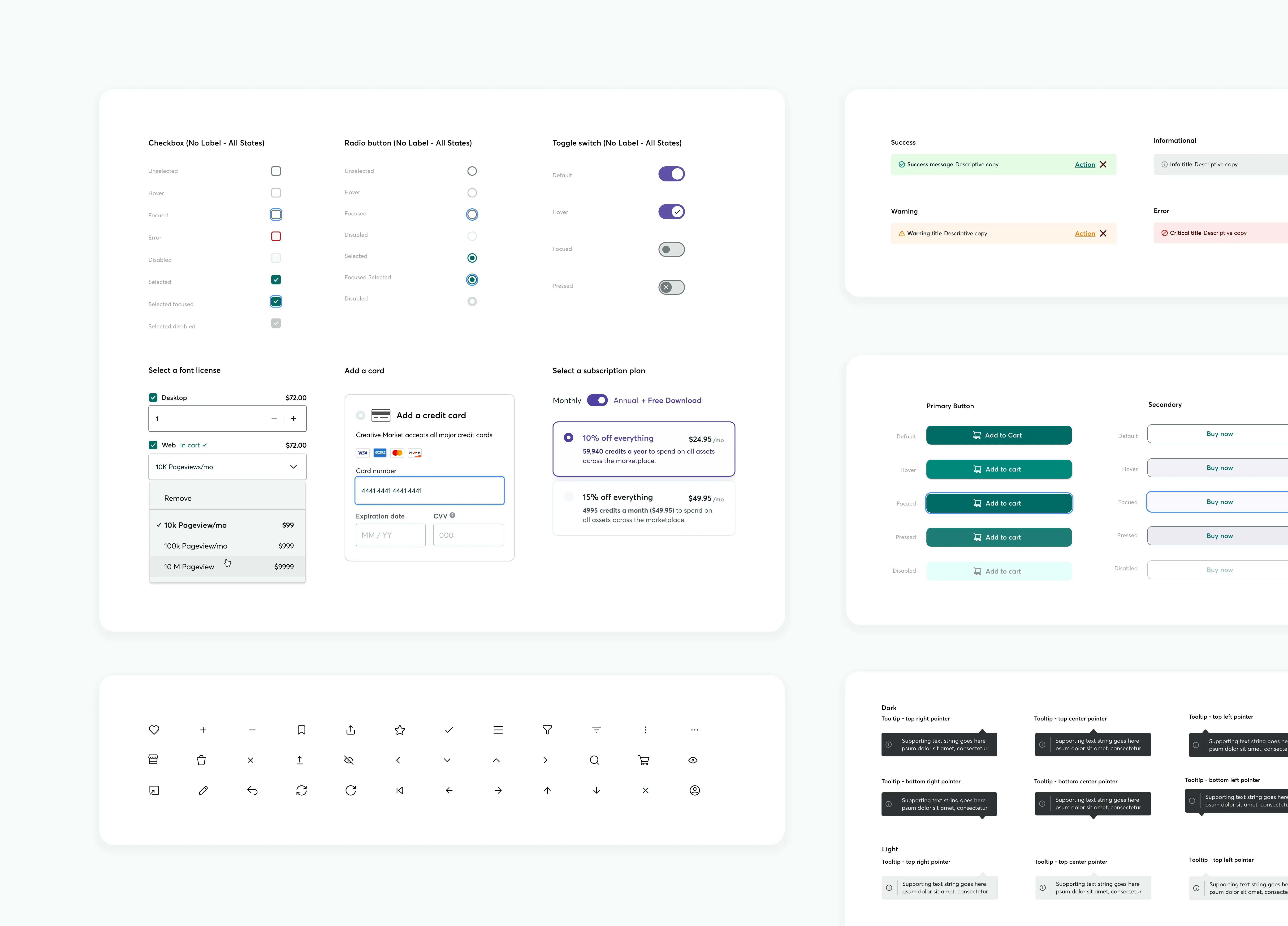
Effective communication is essential in Product Design, serving as the guiding principle. When properly managed, a Design System can lay the groundwork for future possibilities. This design system, created in Figma, focused on enhancing accessibility and interaction affordance, aligning with existing brand colors, and utilized Google M3 UI Kit to streamline workflows and improve the user experience across all products.
Brand
Creative Market
Role
Sr Product Designer
Platforms
Desktop / Mobile / Internal apps
Date
Jan 23, 2024
Base components and common UI patterns
Background
The design system aimed to unite design and engineering through a shared language, promoting collaboration. It facilitated communication and established a common workflow between the two fields. This was achieved using a common vocabulary, which saved time and prevented miscommunications.
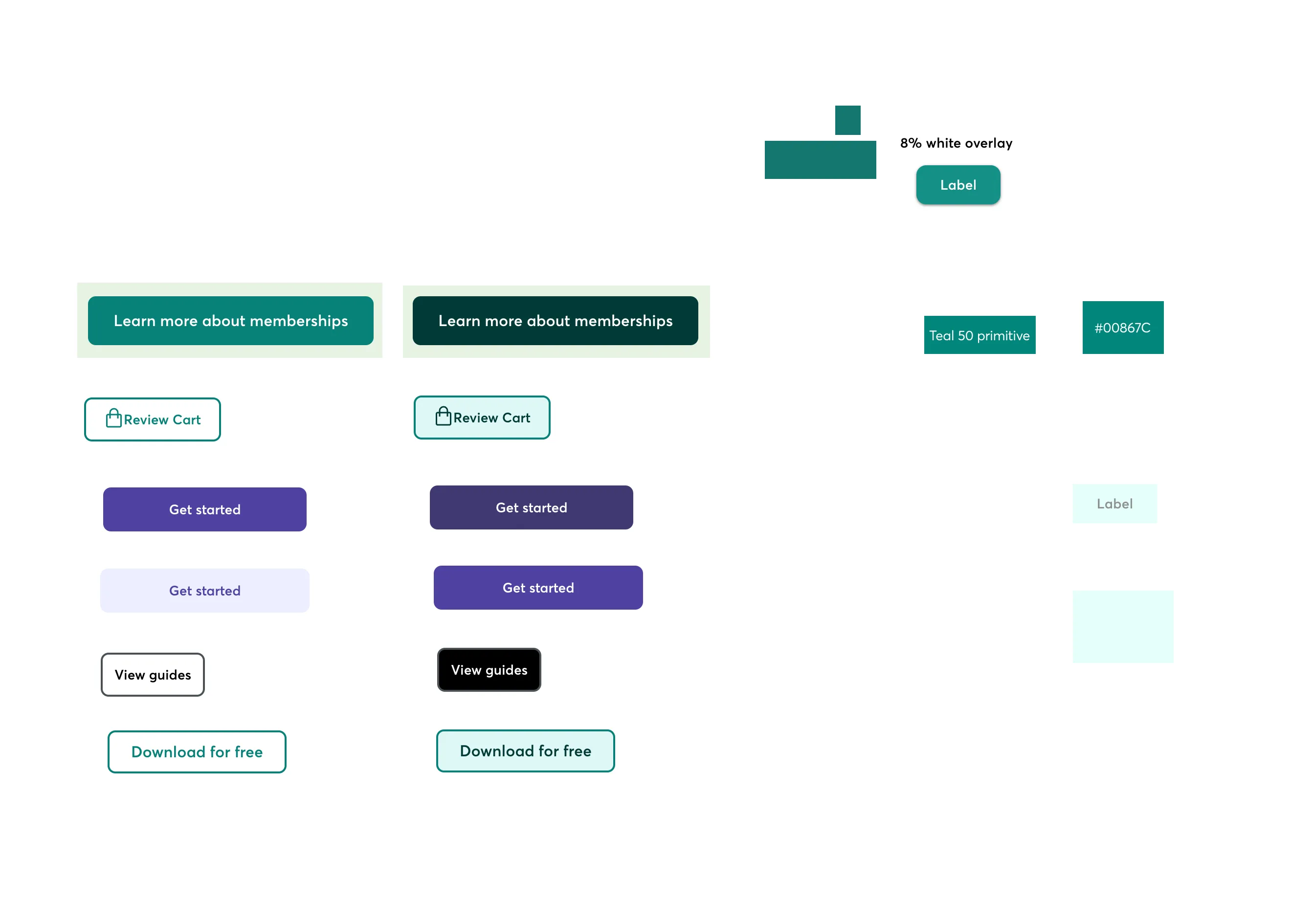
Developer Creative Market button audit
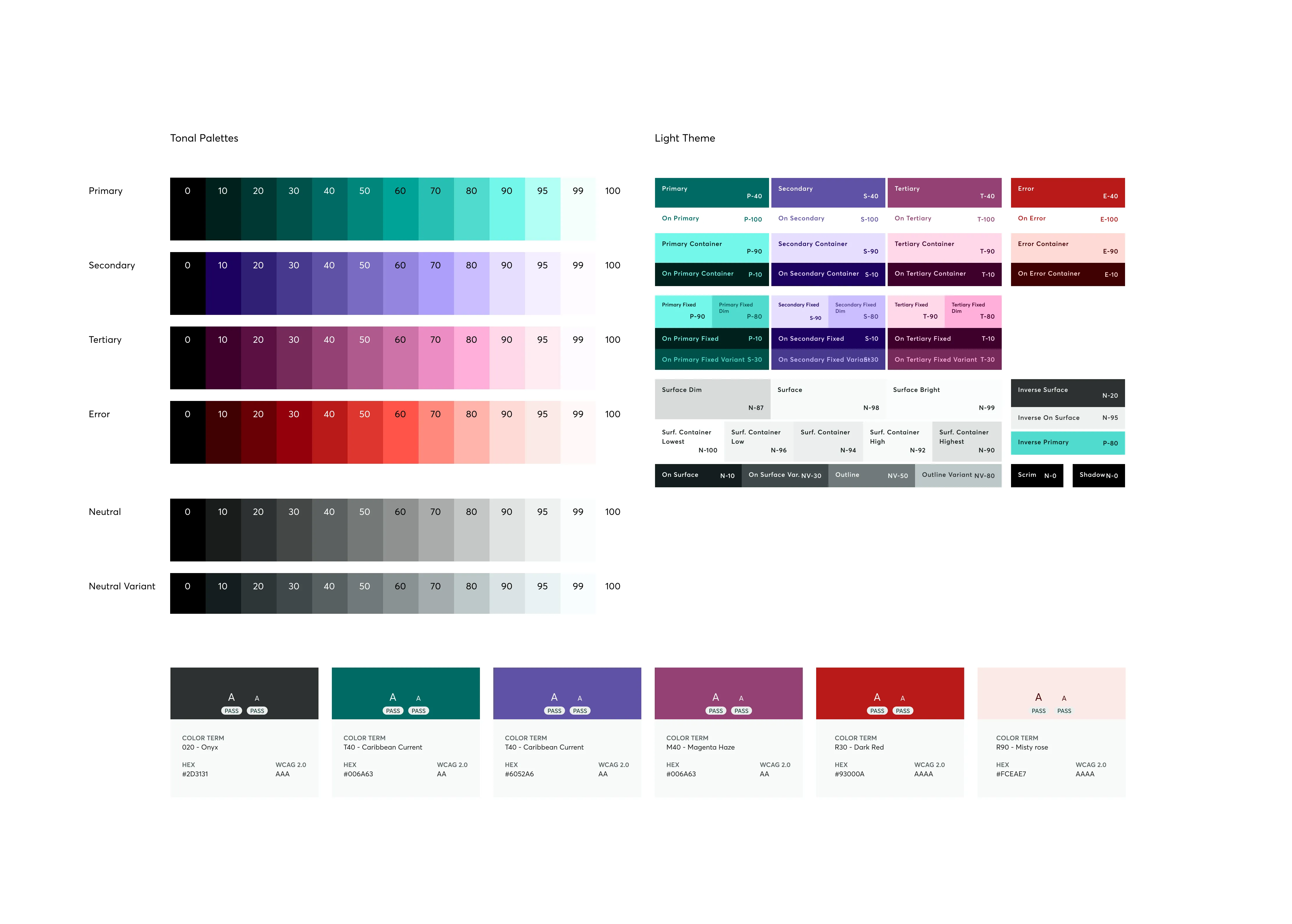
Material color guidance and accessibility test results
Approach
The system incorporated design patterns that served as efficient, reusable solutions, making the development processes faster and saving valuable time. These patterns provided predictability, reduced uncertainties in project outcomes, promoted scalability, and ensured a consistent user experience, contributing to a cohesive and reliable product.
Business Efficiency: The design patterns optimized development processes, saving time.
Predictable Outcomes: The proven solutions embodied in design patterns minimized uncertainties in project outcomes.
Scalability and Consistency: The reuse of design patterns promoted scalability and ensured a consistent user experience.
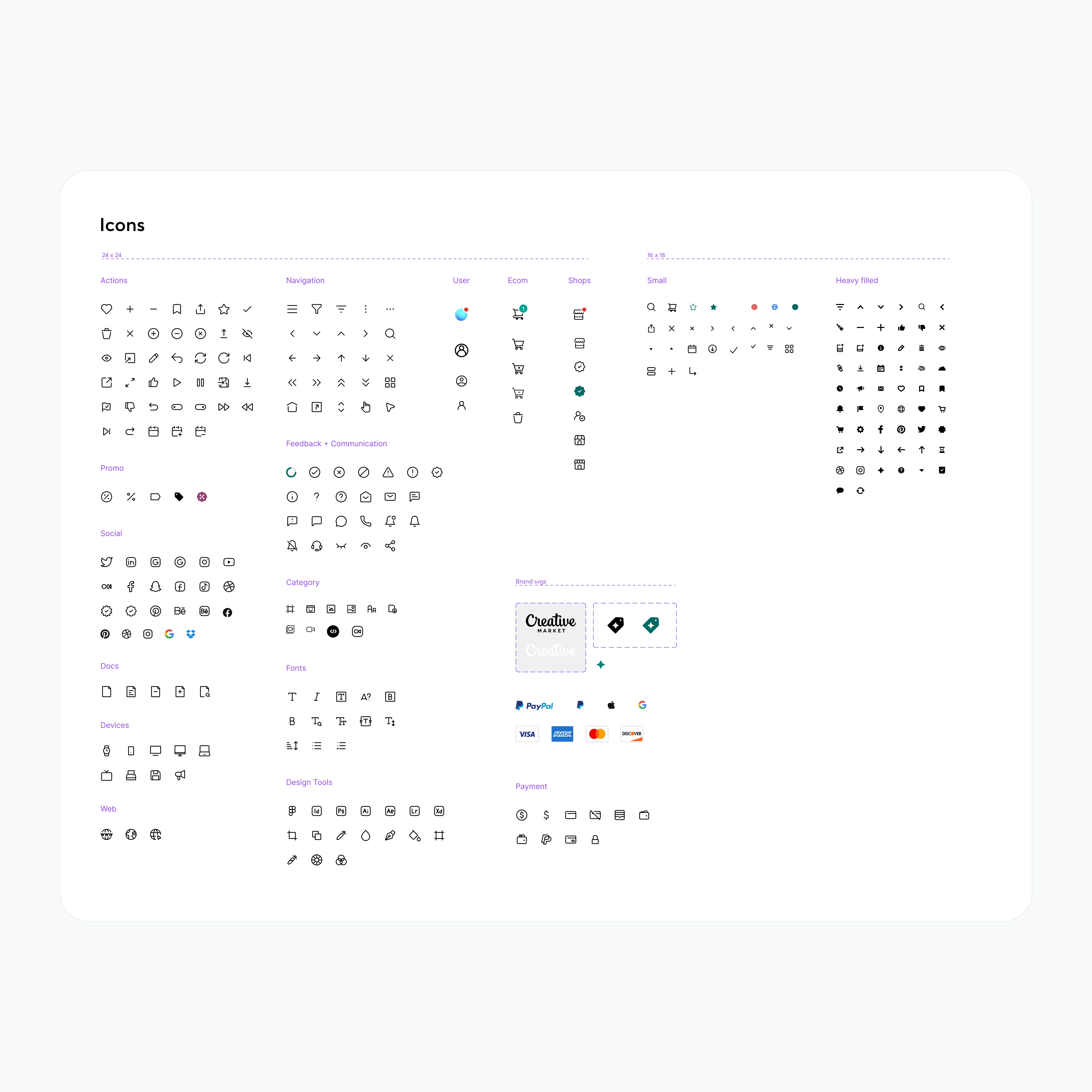
Creative Market brand assets, icons and svgs
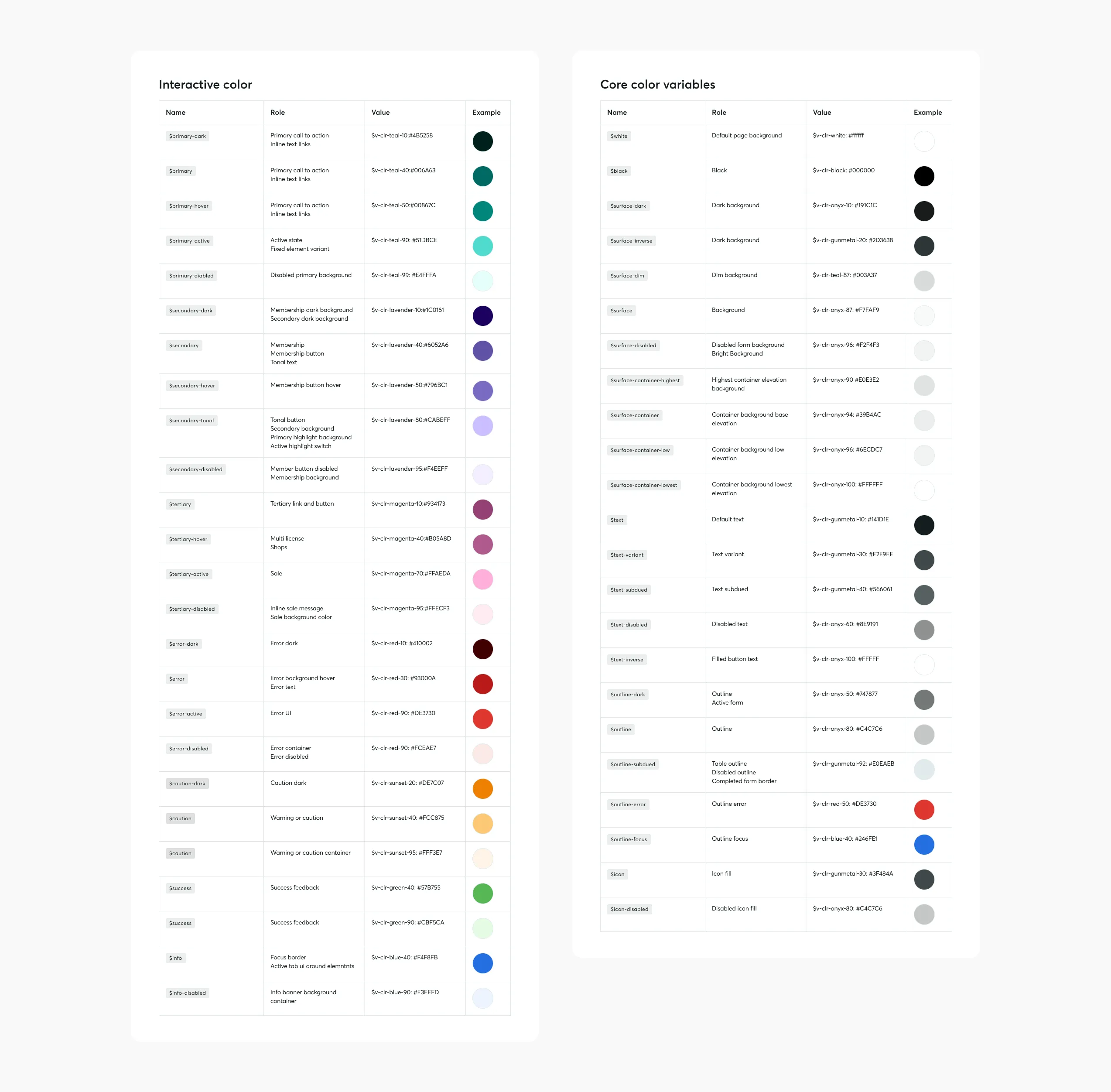
Interactive and core color tokens for Creative Market
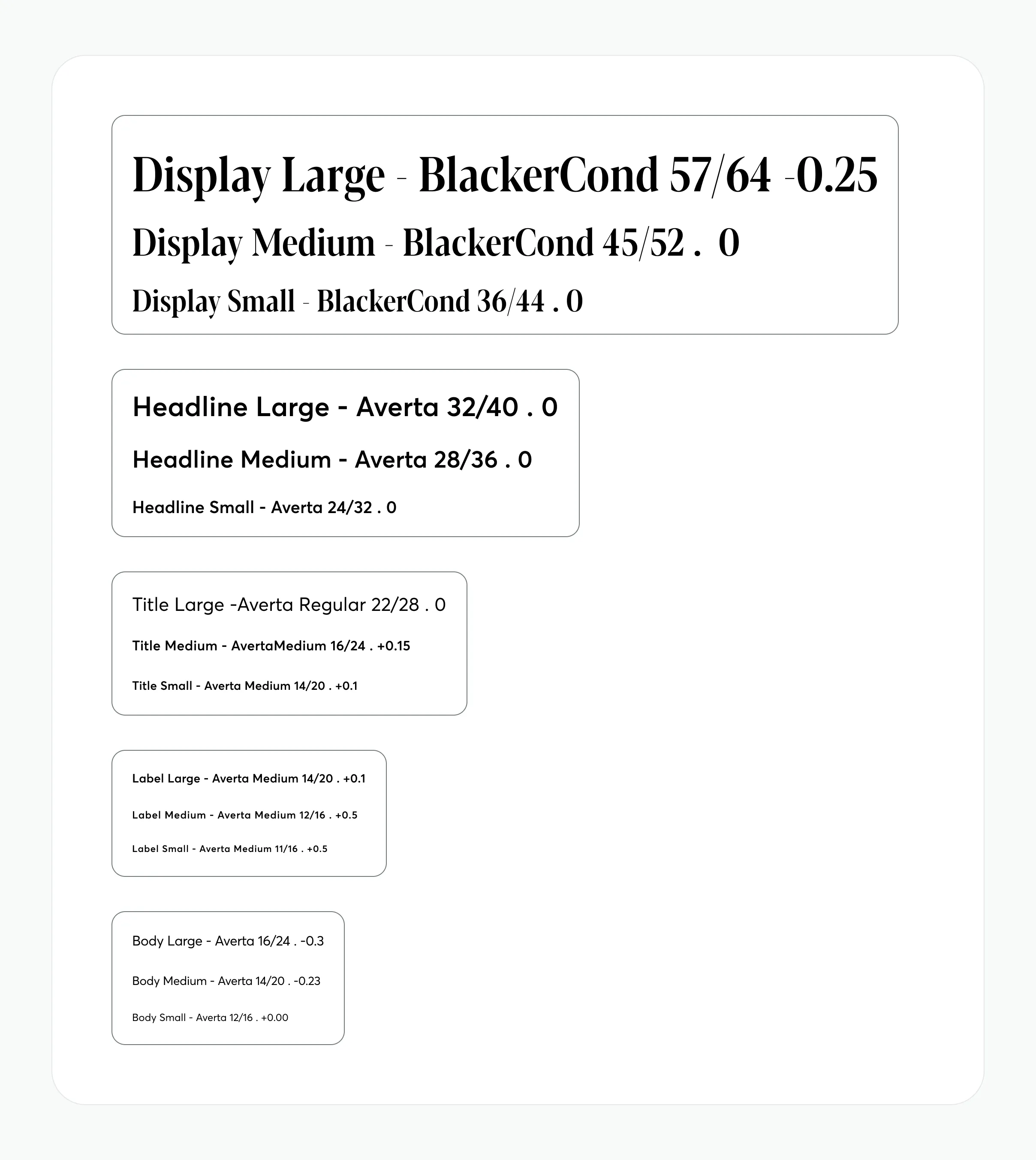
Typeography scale and font sizing
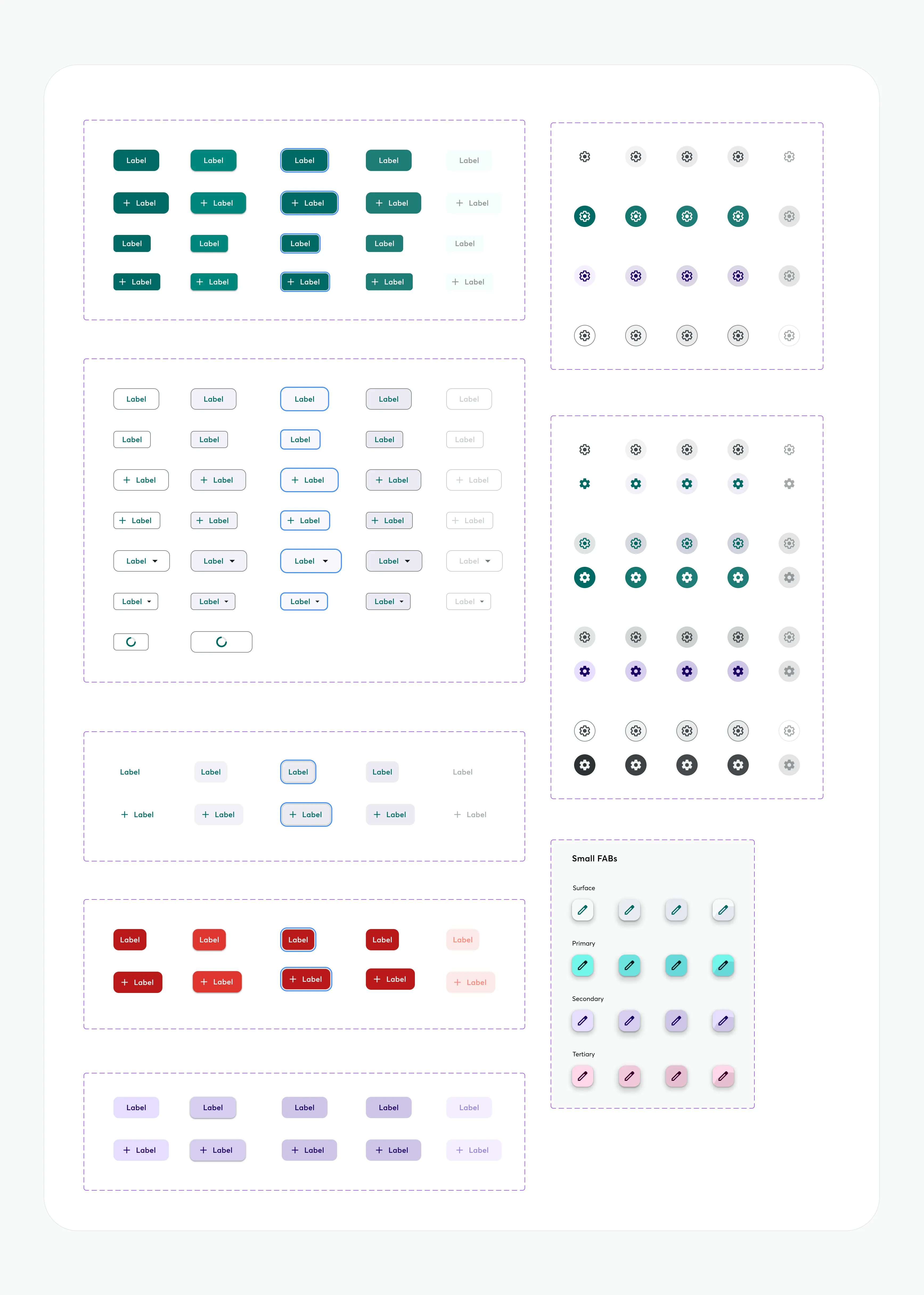
Creative Market Button component
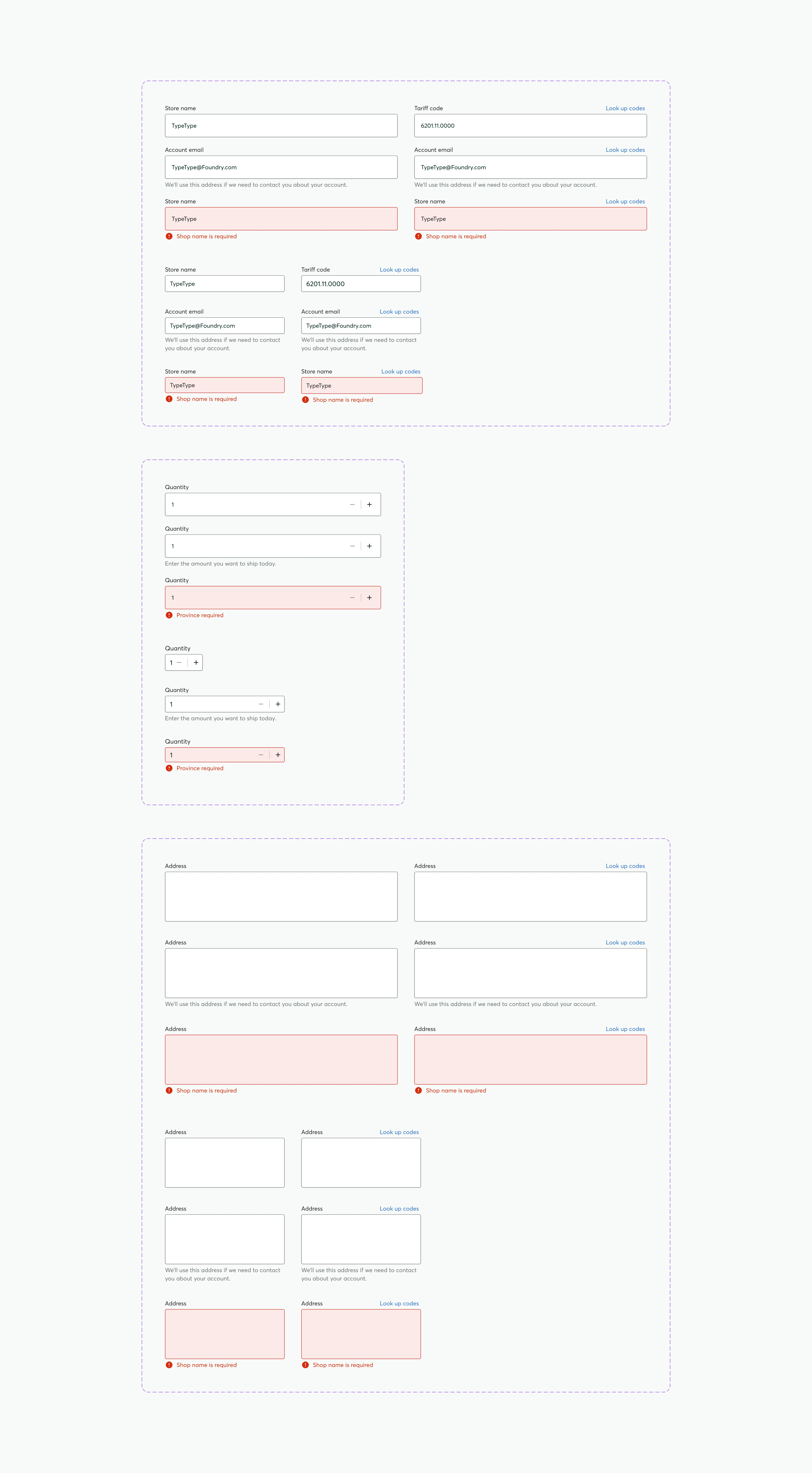
Text field component documentation
Impact
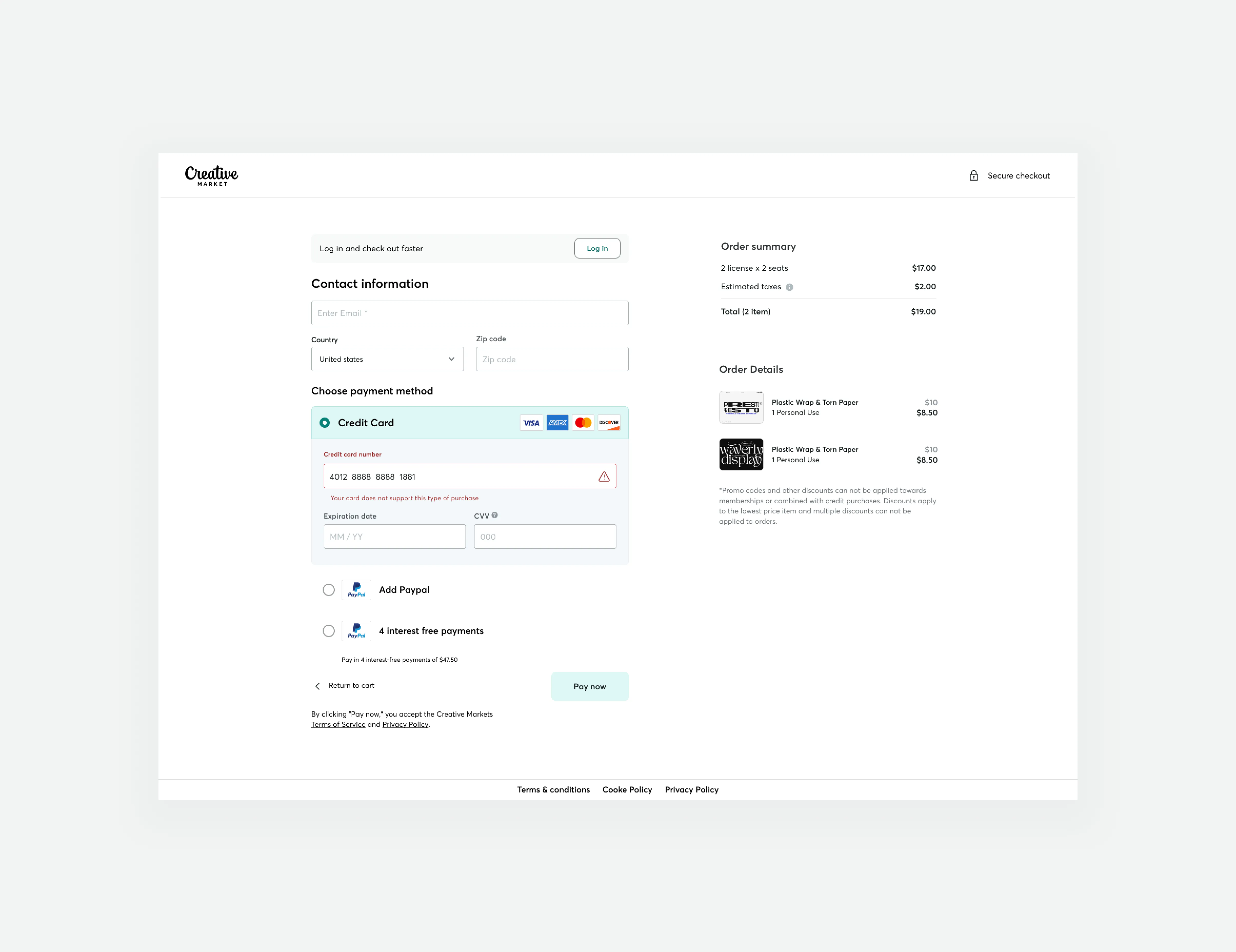
The design system's impact is evident in the improvements made to the Guest Checkout and Buy Box. For the Guest Checkout, the system simplified the flow, reduced user effort by only collecting essential information, and used prominent calls-to-action. For the Buy Box, the system revamped the interaction design, improved banner messaging, and made the buying experience for fonts responsive on mobile devices. Thus, the design system played a crucial role in the success of these projects.
More Case Studies
Guest checkout impact at Creative Market
We successfully increased conversion rates and revenue generation by developing a new guest checkout aimed at reducing cart abandonment rates. This accomplishment was made possible by emphasizing primary calls to action, adopting form design best practices, and prioritizing trust and security.
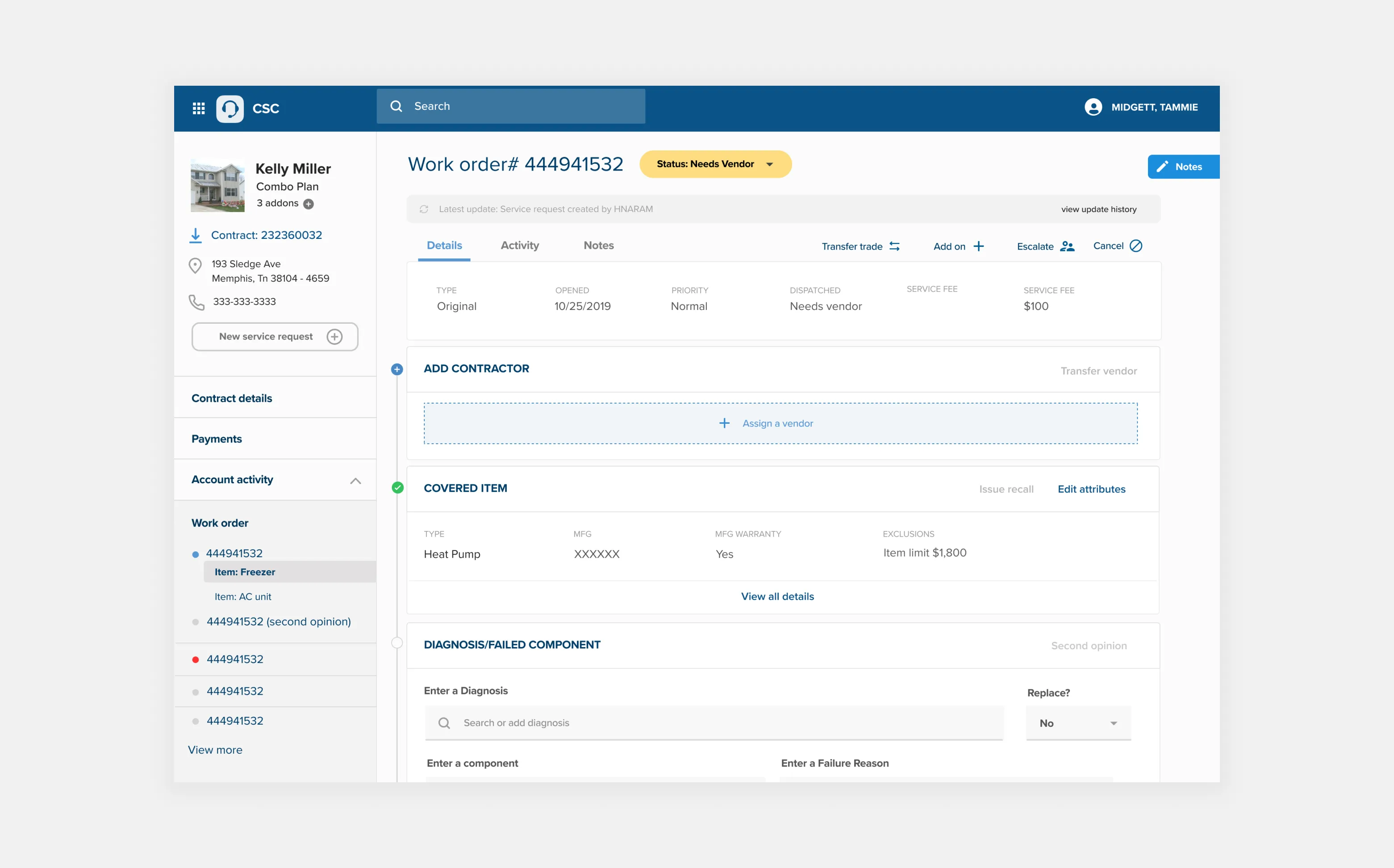
Home warranty claim at American Home Shield
American Home Shield (AHS) is a leading provider of home warranty services, offering coverage for essential home systems and appliances. One critical aspect of their service is evaluating and authorizing warranty repair requests made by contractors. This case study explores the process of redesigning the Warranty Repair Authorization Tool, integrated into the service agent portal, to streamline the process and improve key metrics like time on task, information retrieval and operational efficiency.
