Improving the font buying experience at Creative Market
The Product and Design team at a leading online marketplace for fonts and digital assets identified a need for continuous improvement. Their goal was to simplify the font selection process, streamline purchases, consolidate interactions, and increase conversions. Following the successful launch of an update that improved multi-license purchases, the team decided to further refine the font selection process.
Brand
Creative Market
Role
Sr. Product Designer
Platforms
Desktop / Mobile
Date
Feb 15, 2024
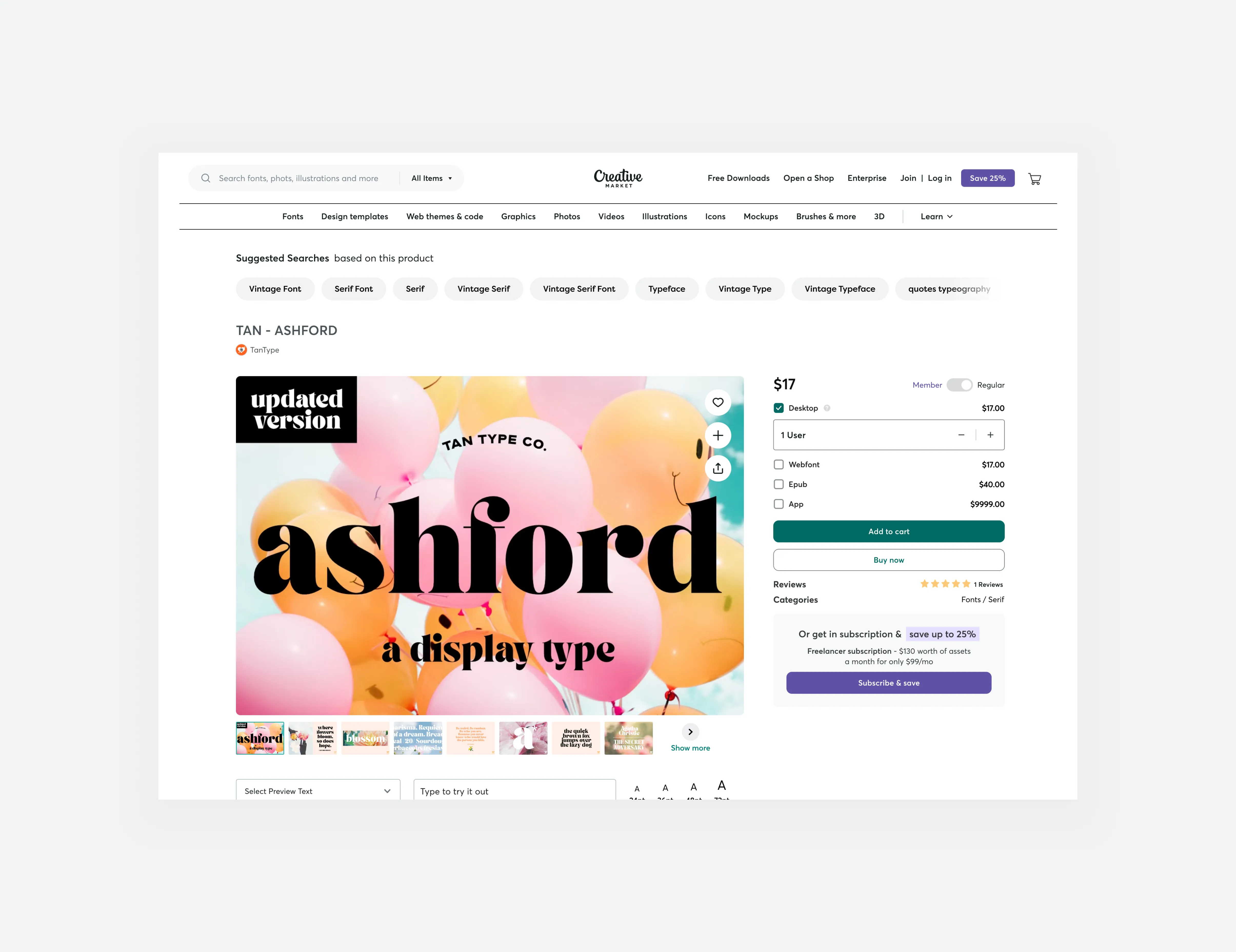
Redesigned font licensing purchase options
Background
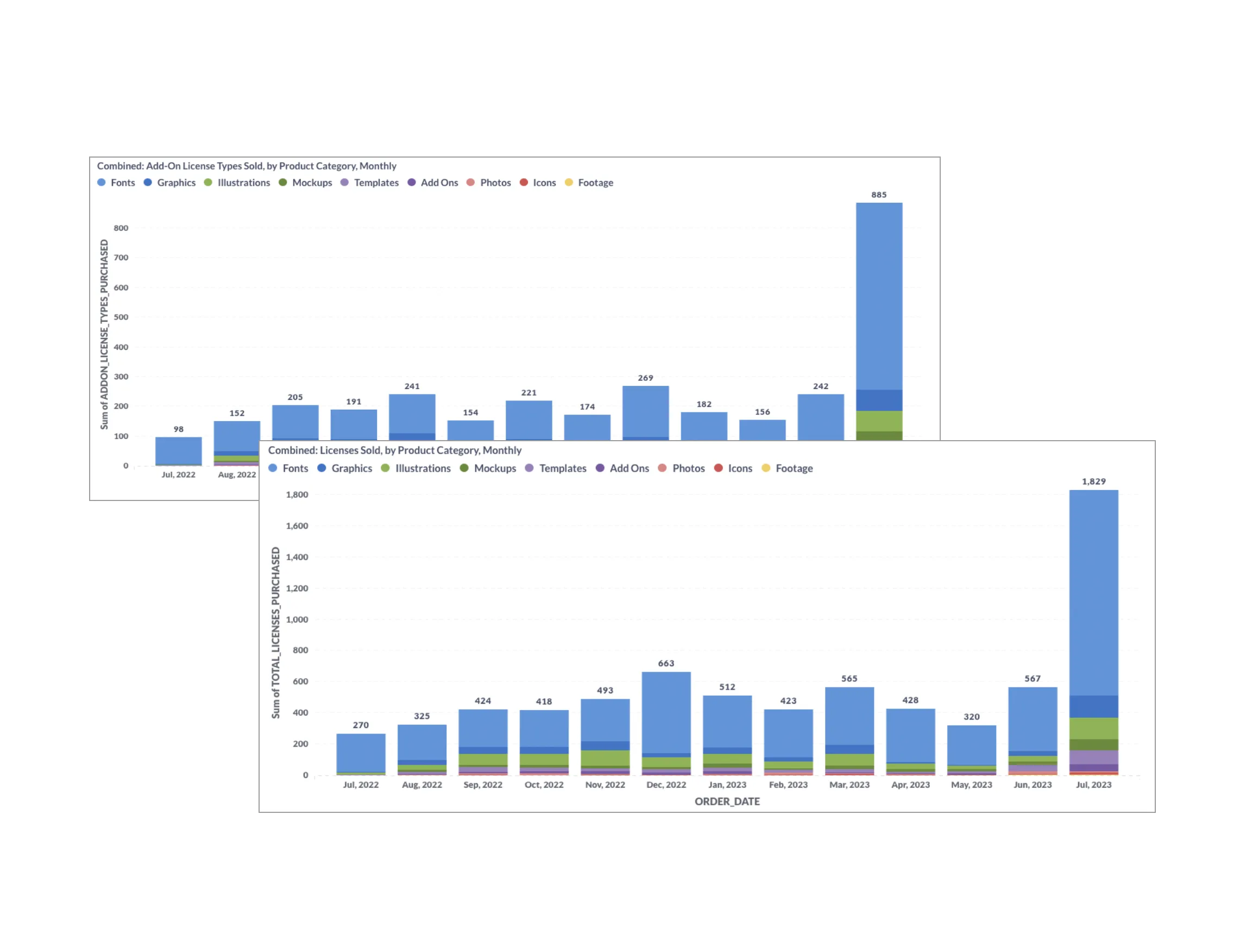
The project aimed to improve core metrics for the "add to cart" feature and purchase conversions. The team saw the need to combine similar interactions, provide pertinent inline banner messaging, and streamline the font purchasing process for all users. The MVP launch had already shown promising results, including significant increases in monthly purchases, add-ons, and Gross Merchandise Value (GMV). With this success, the team focused on optimizing the font license buy box to boost user engagement and revenue. The issues they were addressing included:
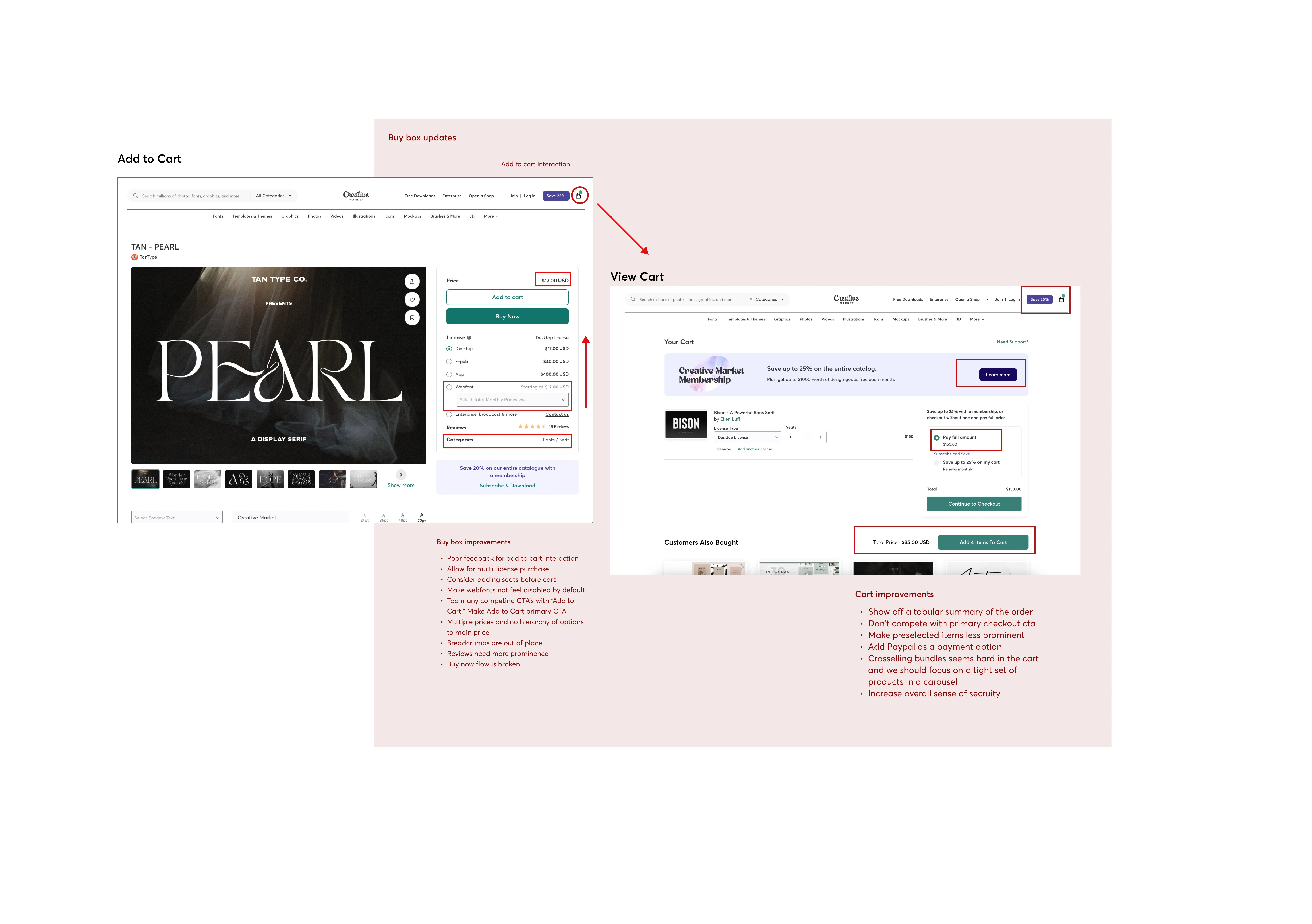
The confusing experience of the buy box.
The aim to remove the extra step of the modal to reduce friction.
The goal to increase conversions from Product Detail Page (PDP) to add to cart and from add to cart to purchase.
Metrics from launch of muti license project MVP
Areas of focus for buy box and add to cart
Approach
The design team cooperated closely with product and engineering to gradually improve the font license buy box. They prioritized improving the design while ensuring seamless integration with existing features. They implemented changes to simplify the user journey, improve the visibility of relevant information, and optimize the call-to-action for adding fonts to the cart. They used feedback from previous iterations to tackle pain points and improve overall usability. The team emphasized:
All-in-one functionality
Add to cart and update cart features
Clear view of what’s in the cart
Video of buying multiple font licenses on Creative Market
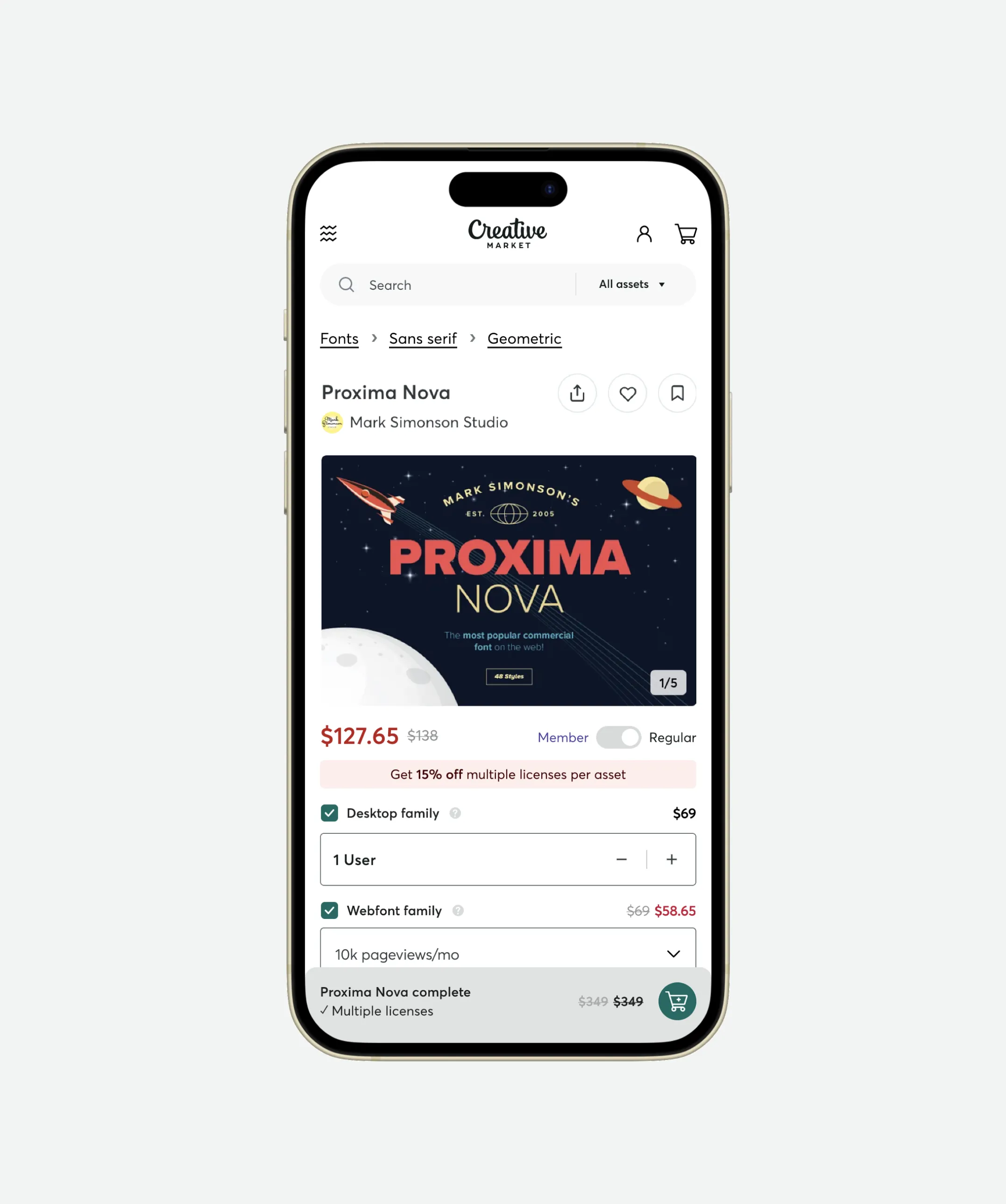
Mobile font details page sticky add to cart
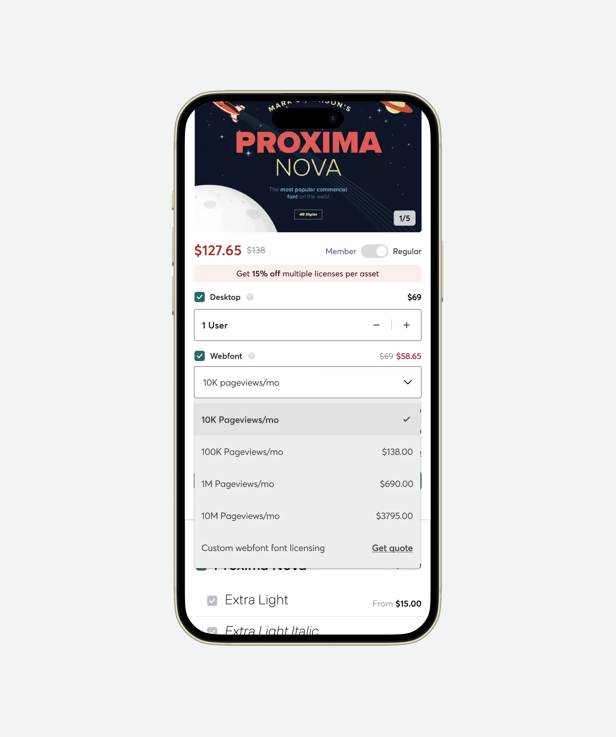
Mobile font detail page with wefont tier select menu open
Impact
The enhancements to the font license buy box led to substantial improvements in key metrics. The second version of the buy box increased "add to cart" rates by 29%, from 4.43% to 5.73%. The conversion rate from viewing a product to adding it to the cart and then purchasing it improved by 46%, from 2.41% to 3.52%. This significant growth in conversion rates led to a noticeable increase in revenue. The project also underscored the importance of scoping, backend team collaboration, and the impact of minor design changes on user engagement. The team plans to continue refining and enhancing the font purchase experience in the future.
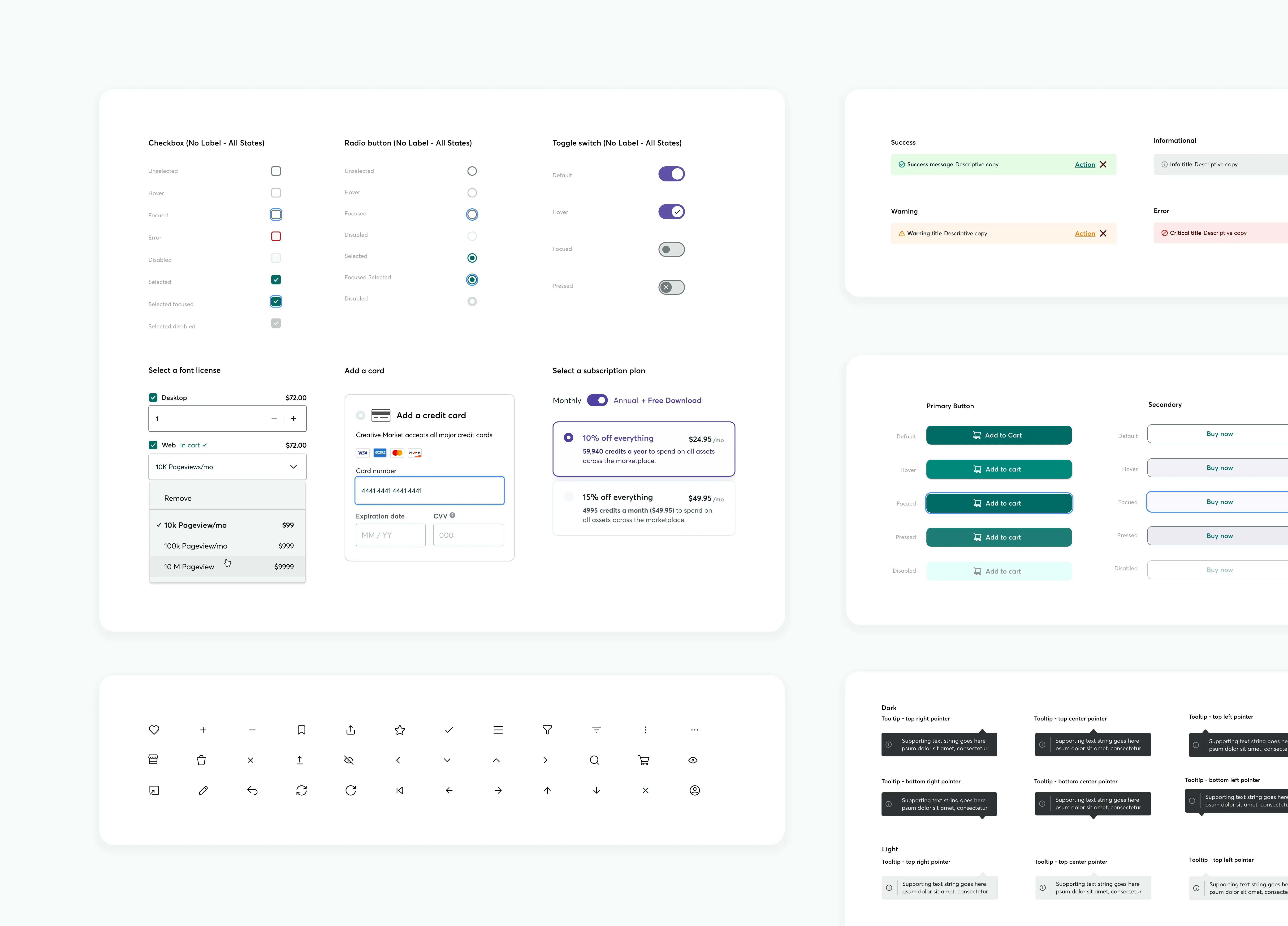
The effective implementation of our design system facilitated many improvements. Its reusable design patterns enabled a consistent and efficient redesign of the buy box. This allowed us to concentrate on minor design changes, which significantly increased user engagement.
More Case Studies
Building an Accessible Design System at Creative Market
Effective communication is essential in Product Design, serving as the guiding principle. When properly managed, a Design System can lay the groundwork for future possibilities. This design system, created in Figma, focused on enhancing accessibility and interaction affordance, aligning with existing brand colors, and utilized Google M3 UI Kit to streamline workflows and improve the user experience across all products.
Guest checkout impact at Creative Market
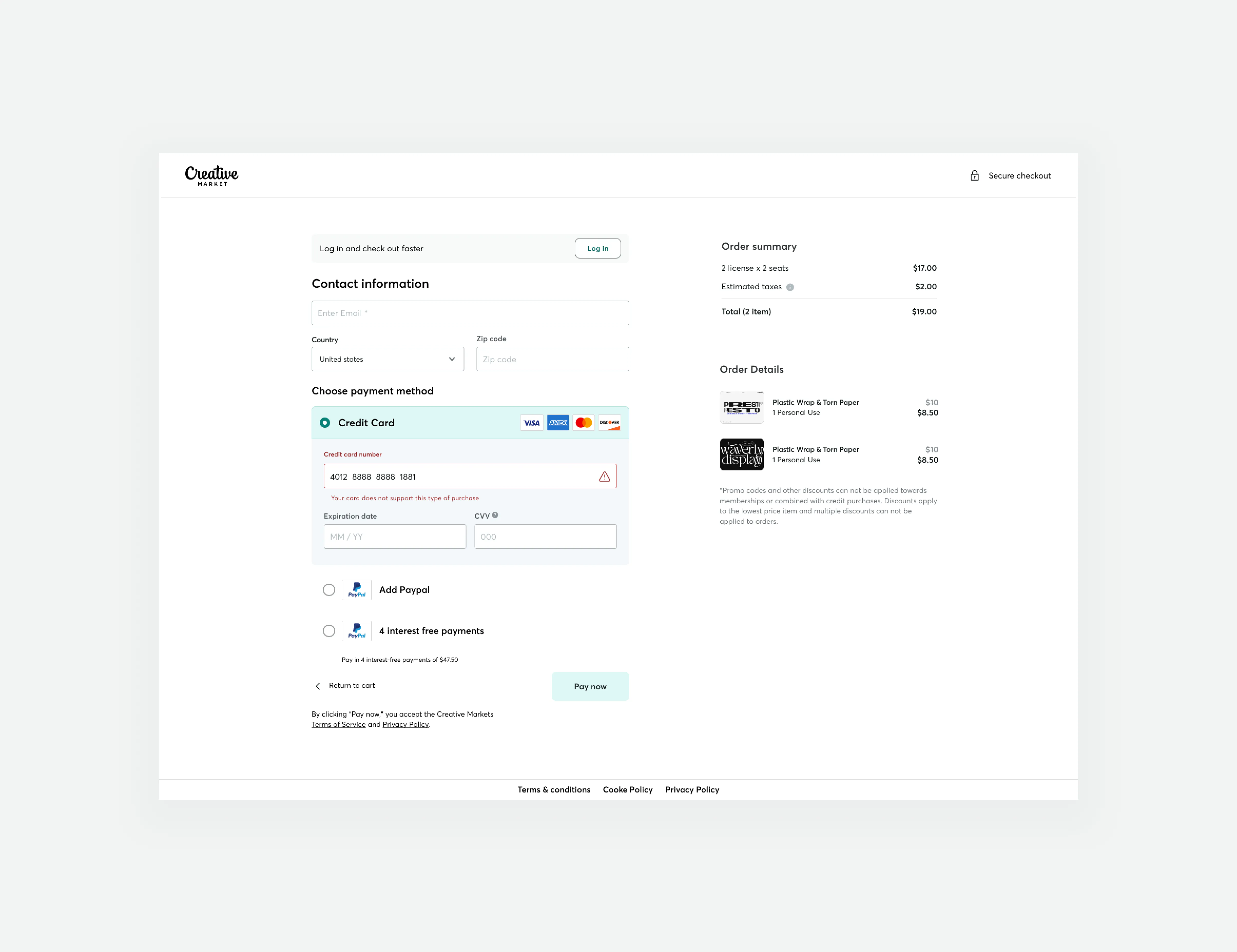
We successfully increased conversion rates and revenue generation by developing a new guest checkout aimed at reducing cart abandonment rates. This accomplishment was made possible by emphasizing primary calls to action, adopting form design best practices, and prioritizing trust and security.
