Multi-brand Design System at Frontdoor
A unified design system that allows Developers, UX Designers and Product Managers to navigate various Frontdoor internal products and manage themes with design tokens for the American Home Shield and other home warranty brands.
Brand
Frontdoor
Role
Senior Product Designer
Platforms
Desktop / Mobile / Interal apps
Date
Jan 14, 2022
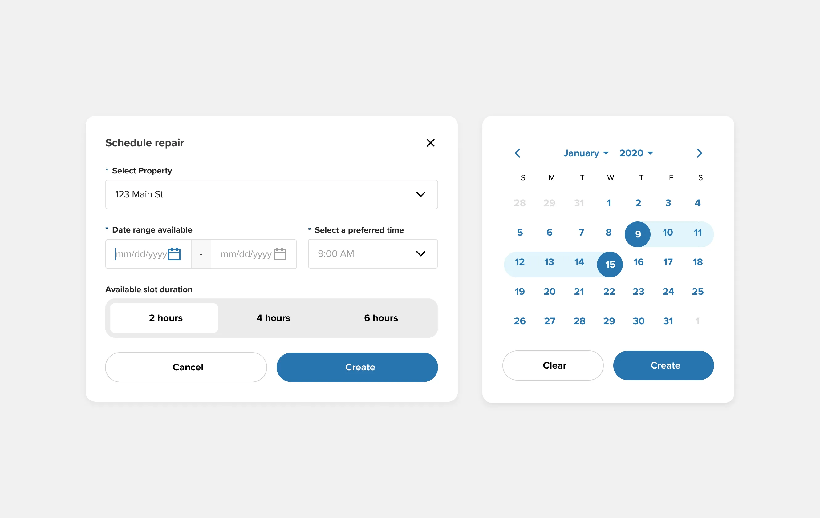
Simple booking widget created from design system
Background
Frontdoor stands as a prominent home service provider, delivering an extensive selection of home protection plans and services to homeowners throughout the United States. Its diverse portfolio encompasses several sub-brands and products, including American Home Shield, HSA Home Warranty, Landmark Home Warranty, OneGuard Home Warranty, and Natural Hazard Disclosure. Within this comprehensive framework, Frontdoor manages a wide-ranging user base and a suite of internal tools, forming a complex ecosystem. Achieving smooth operations and delivering exceptional customer experiences within this intricate environment demands meticulous design, adept management, and seamless coordination.
Frontdoor serves a diverse range of users, including homeowners seeking home protection plans, service contractors responsible for performing repairs and maintenance, and internal teams comprising business and customer service professionals who manage customer inquiries, process claims, authorize service amounts, and analyze data. It's crucial to have a design system that supports all these use cases within Frontdoor's ecosystem because it ensures a consistent, user-friendly experience across the board.
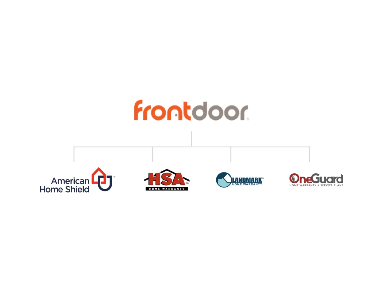
Frontdoor sub-brands: American Home Shield, HSA, Landmark and OneGuard
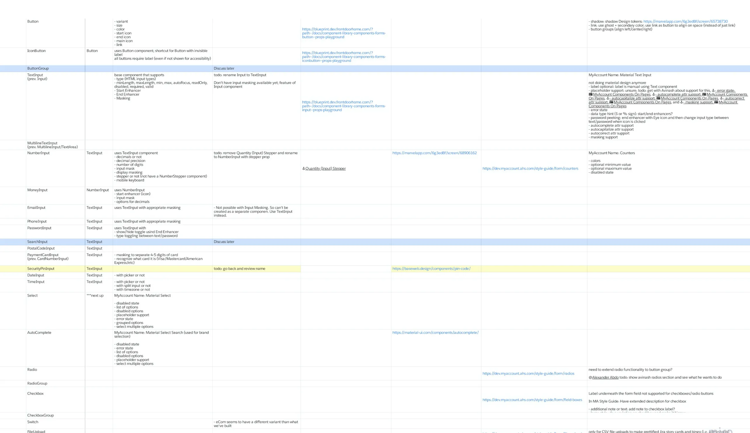
Component inventory priortized by utilization
Approach
We started by auditing all of the design patterns in our existing platforms along with any new projects that would consume the component library. This helped prioritize the order of our components, since the business wanted all new applications needed to leverage the library. We then created an inventory in excel to categorize and count the number of times a component showed up and how many variants we wanted to support. From there we created a base theme of design tokens that could then be extend modified by other brands and product teams that wanted to utilize the components.
Video of the React storybook component library and design system
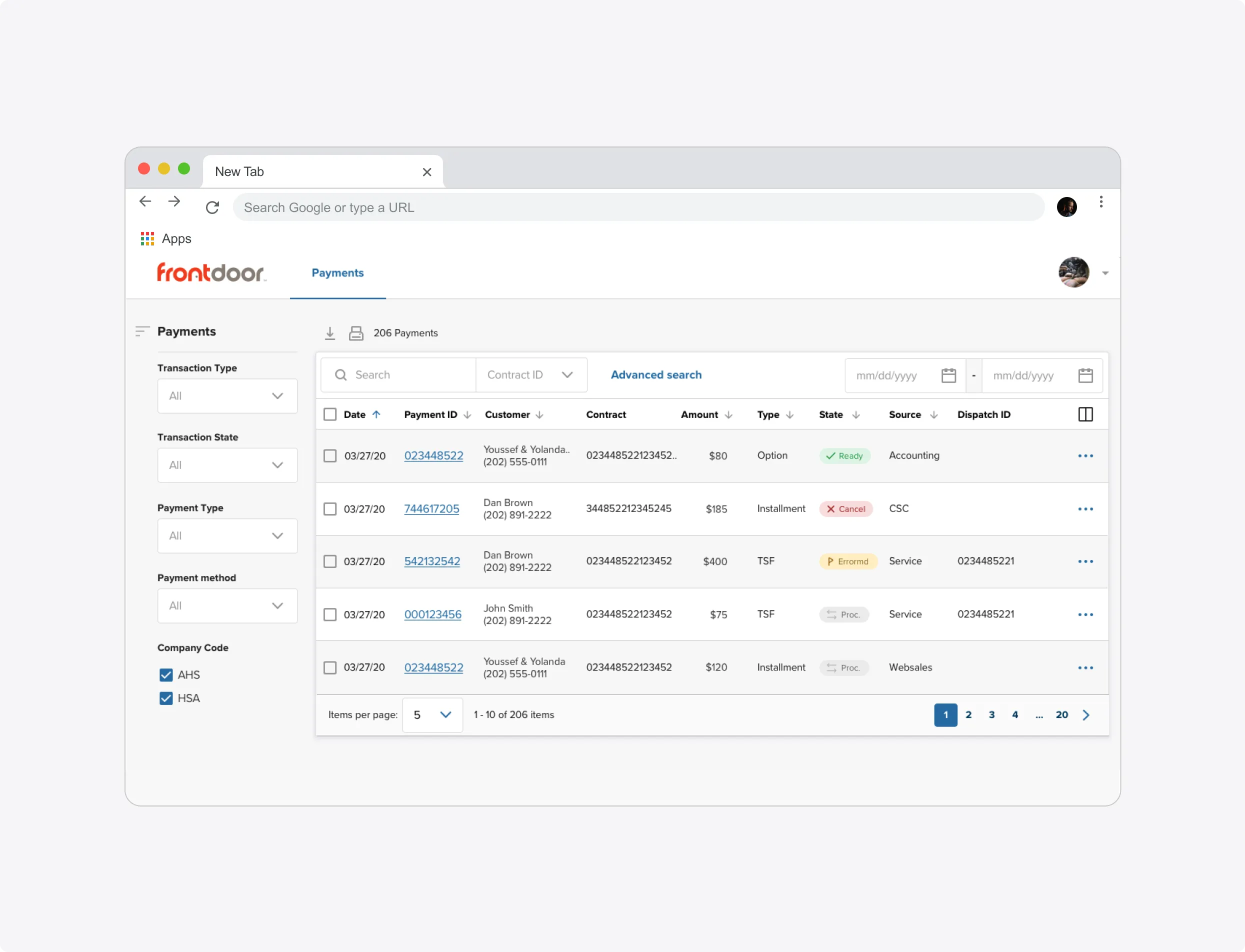
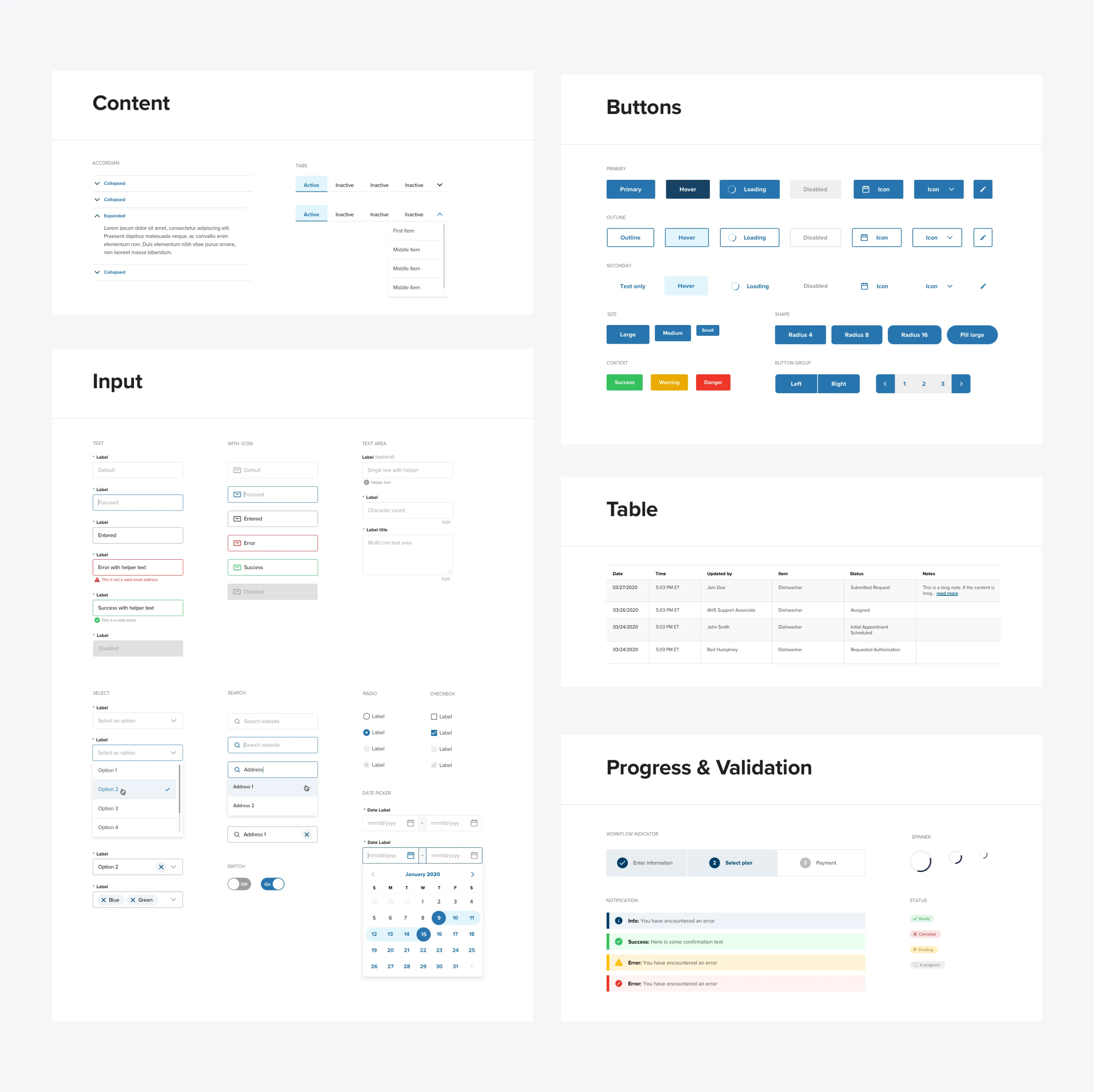
Fontdoor/AHS payments search built with table and filter components
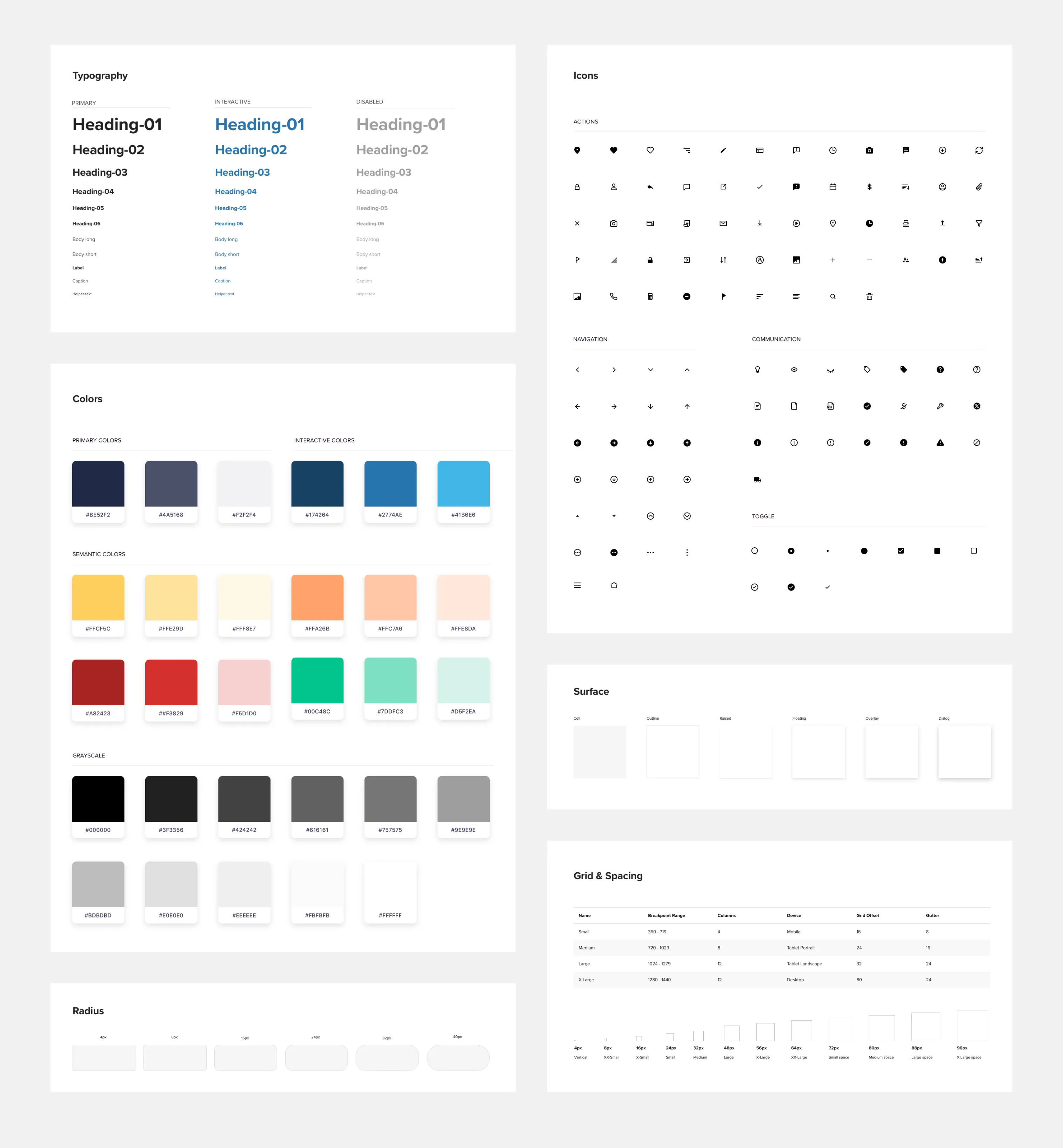
Base level design design componets
Design tokens for American Home Shield theme
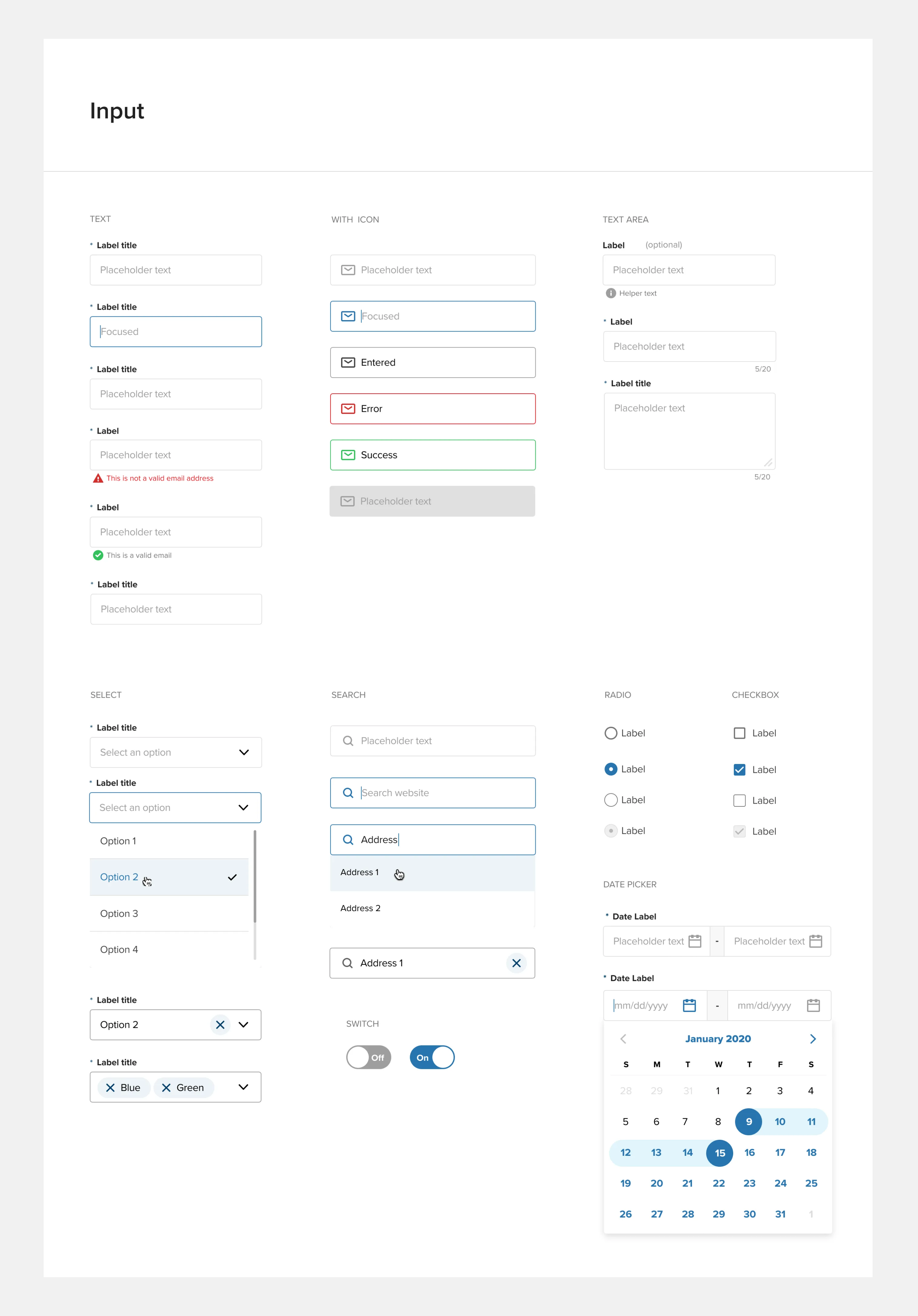
Input component group documentation
Impact
The new system allowed for Frontdoor's efficient development approach to be a multi-product, multi-brand system that streamlines engineering efforts. Instead of reinventing the wheel for each project, developers can utilize pre-designed components, saving time, reducing the risk of bugs, and improving code maintainability. These components automatically propagate updates across the entire product lineup. The system also fosters reusable design patterns, breaking the user interface into modular components shared among teams and products. As Frontdoor expands with new sub-brands and products, it gracefully scales by adding new components while maintaining design coherence. Additionally, version control and comprehensive documentation enhance tracking, updates, and guidance for component usage.
More Case Studies
Building an Accessible Design System at Creative Market
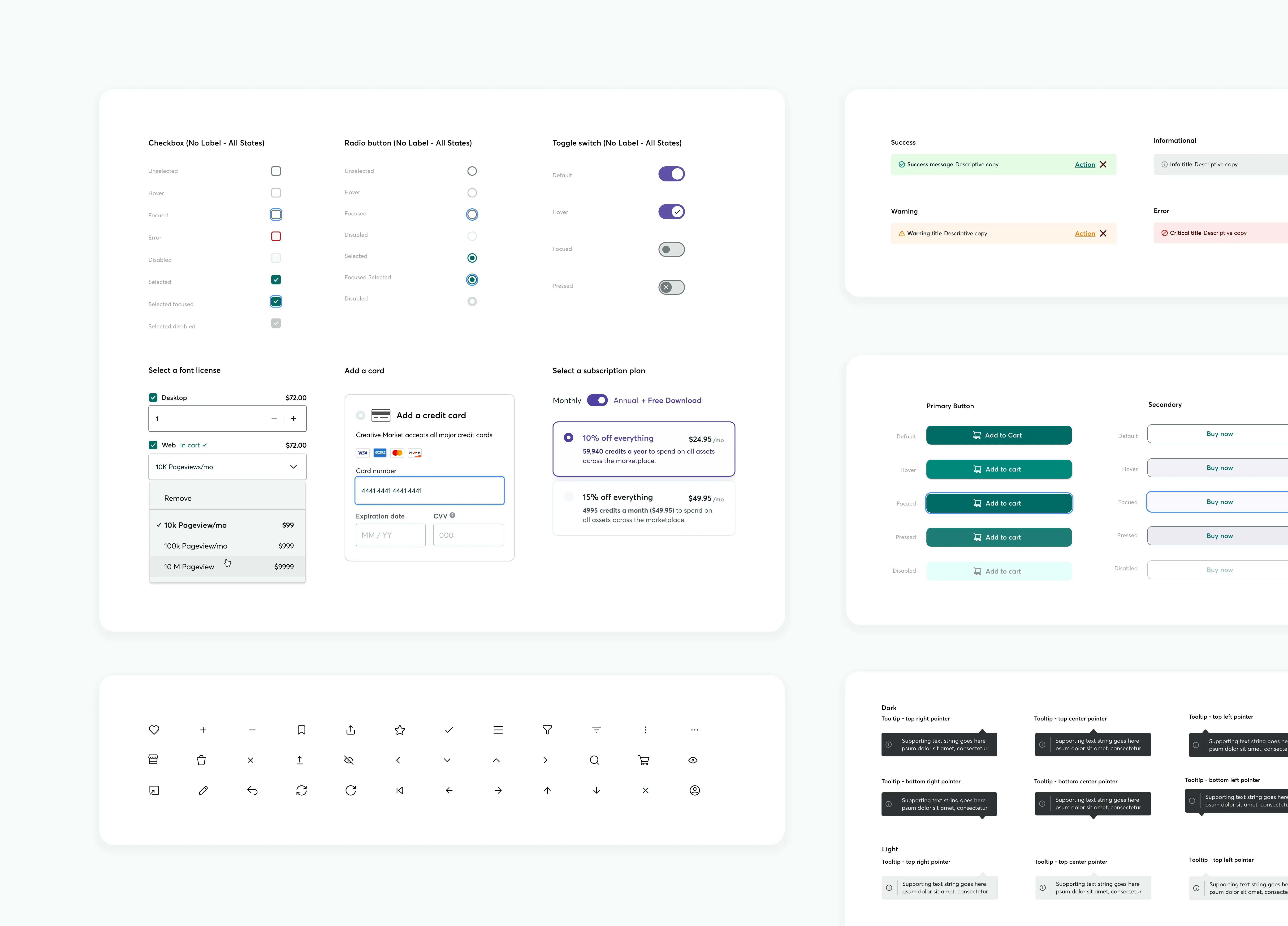
Effective communication is essential in Product Design, serving as the guiding principle. When properly managed, a Design System can lay the groundwork for future possibilities. This design system, created in Figma, focused on enhancing accessibility and interaction affordance, aligning with existing brand colors, and utilized Google M3 UI Kit to streamline workflows and improve the user experience across all products.
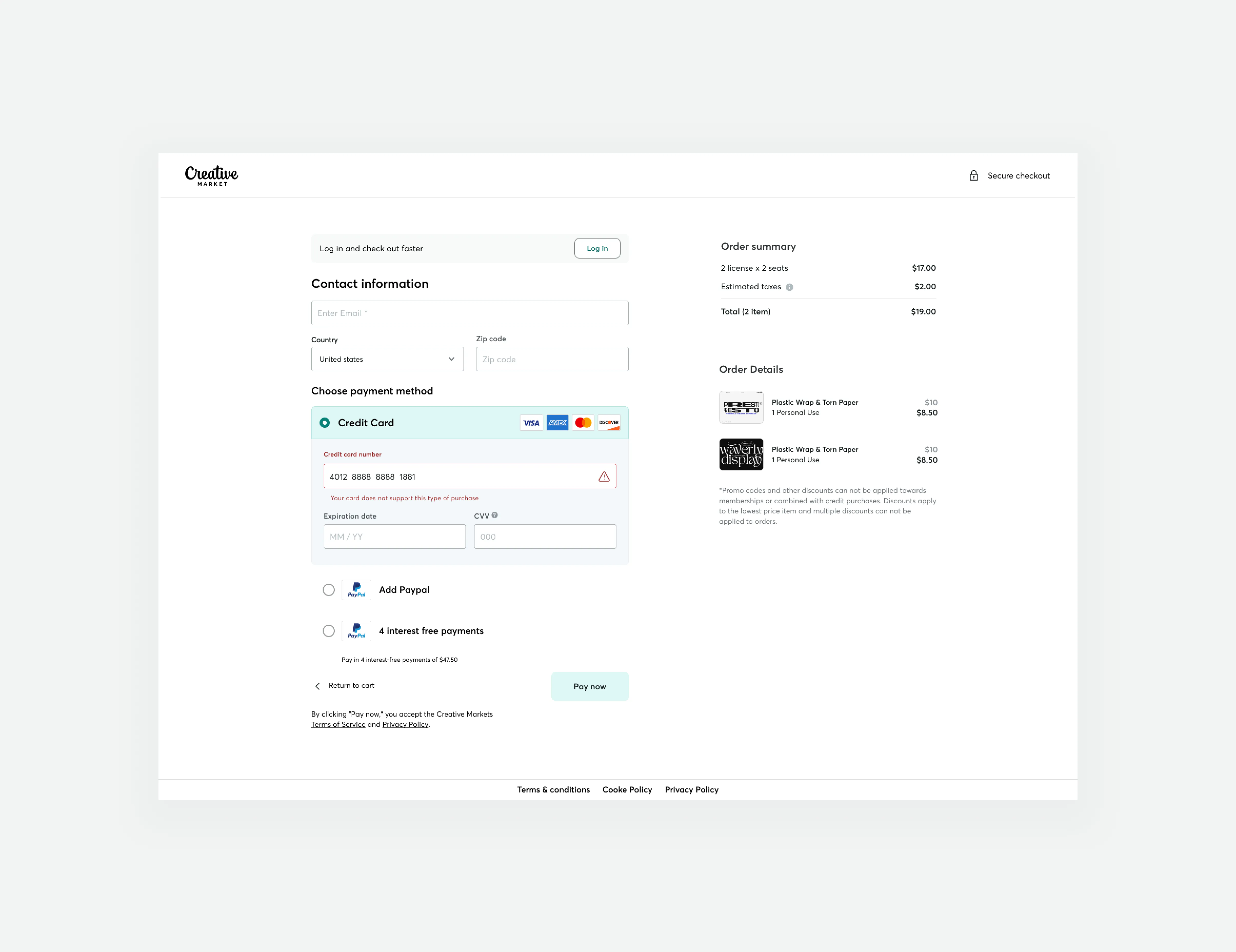
Guest checkout impact at Creative Market
We successfully increased conversion rates and revenue generation by developing a new guest checkout aimed at reducing cart abandonment rates. This accomplishment was made possible by emphasizing primary calls to action, adopting form design best practices, and prioritizing trust and security.
