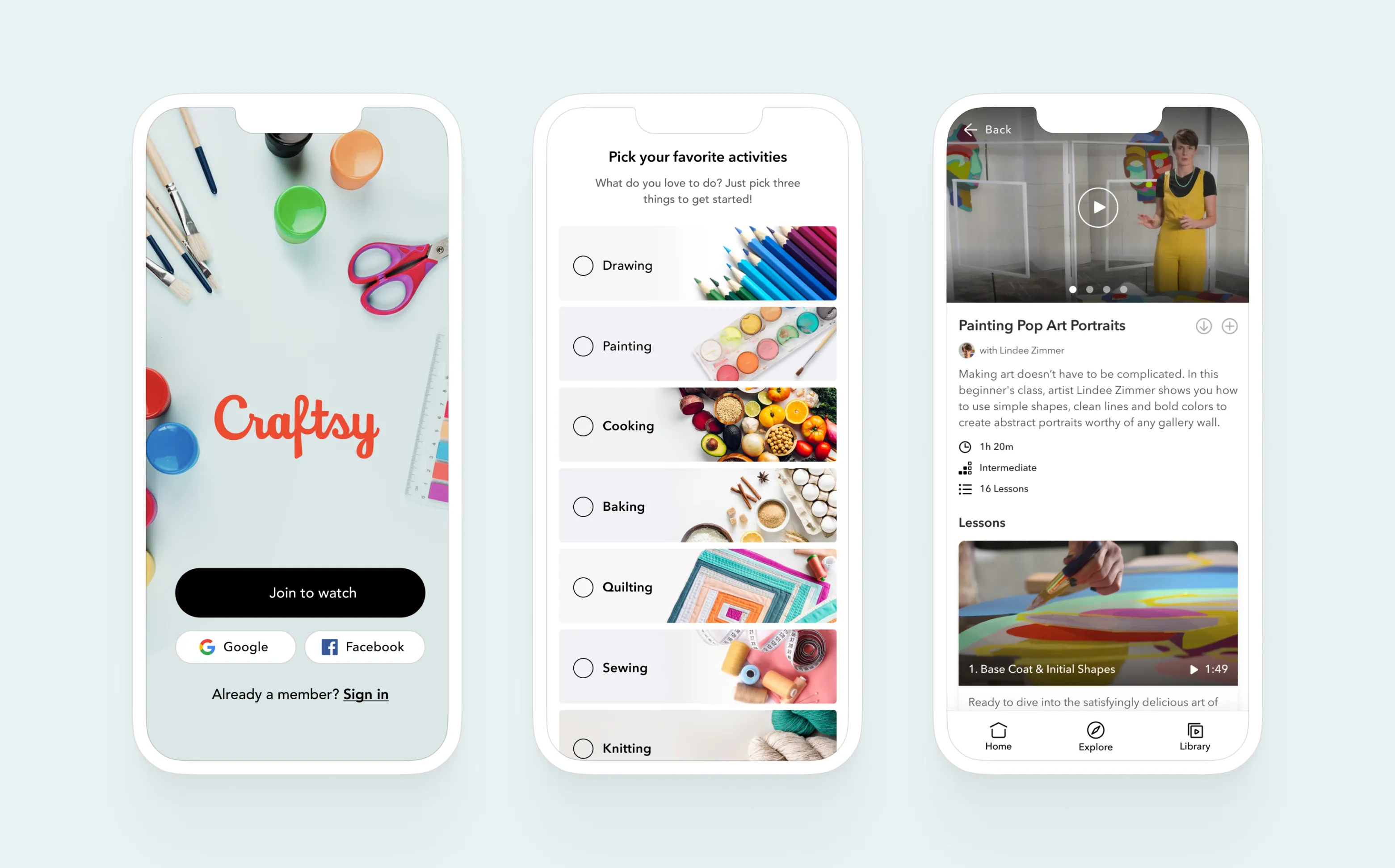
Video eLearning app at Craftsy
In an effort to transform the Craftsy Mobile Apps, our team undertook a complete redesign of all primary flows. This redesign was based on customer feedback, key metrics that needed improvement, and usability testing results.
Brand
Craftsy
Role
UX Designer
Platforms
iOS / Android / Smart TV
Date
Sep 29, 2019
Selected sreens from Craftsy learning app
Background
Craftsy is a platform for video tutorials and written content on various artistic activities, hobbies, and crafts. To recognize the specific needs of the mobile app audience and better understand their expectations, I conducted extensive surveys and usability tests, benchmarked the existing platform, and reviewed feedback from the existing app store.
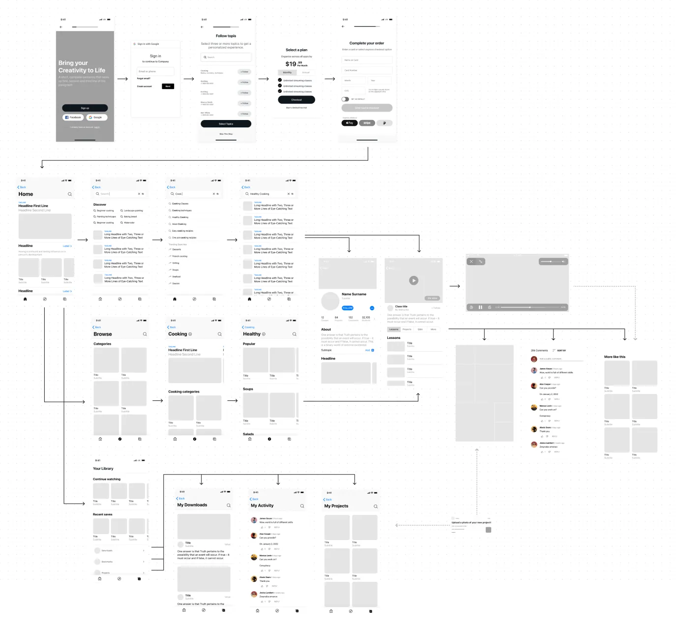
Fig 1. Craftsy App redesigned wireframes and user flows
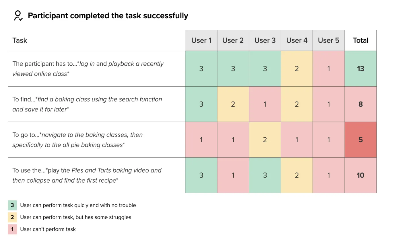
Completed task matrix for usability test
Approach
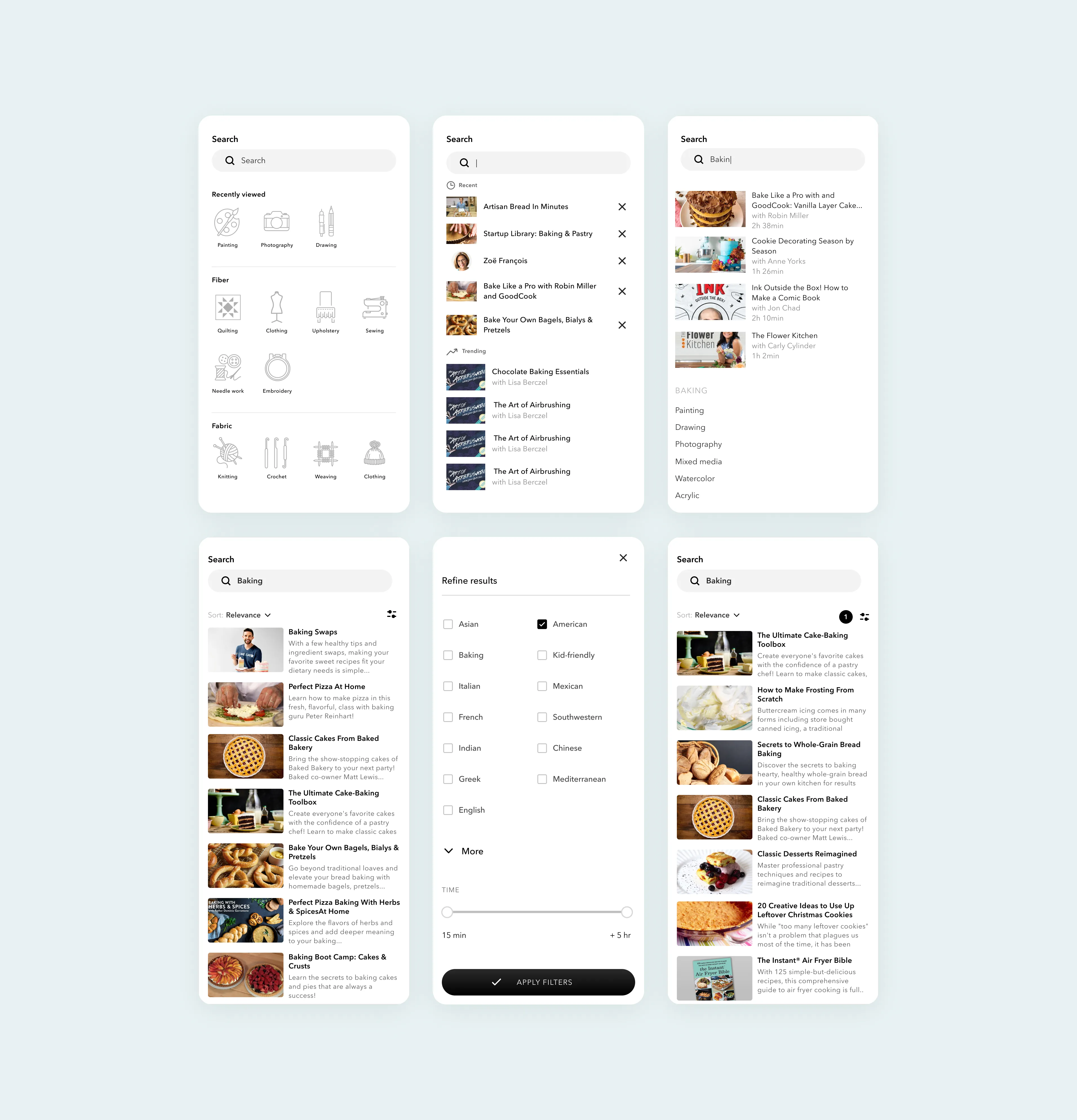
Documenting the end-to-end flow for scoping was crucial to determine the appropriate size for the initial product release, and to plan subsequent work. By synthesizing the research and focusing on the most important functionalities, we could prioritize certain areas. We streamlined the onboarding process to make user registration more engaging and to offer a free trial. To aid in navigating the app's extensive content library, we enhanced content discovery by reorganizing the app's information architecture and introducing sub-categories and filters.
Advanced video interactions for mobile and desktop experience built in Framer
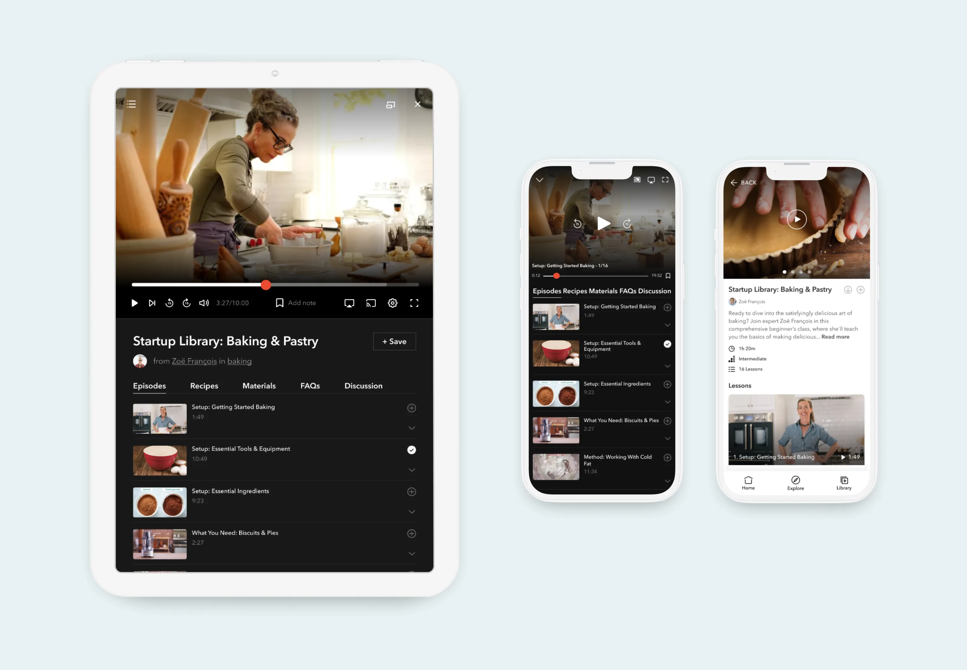
Video player experience on tablet and mobile devices
Class search screen flow
Impact
The result was a high-performing native app for both iOS and Android, which significantly increased the product's rating on the app store and improved overall user satisfaction. The new app enhanced key metrics, such as class watch time, and reduced the number of clicks needed to reach relevant content. This paved the way for further improvements, including second screen casting and multi-device experiences.
More Case Studies
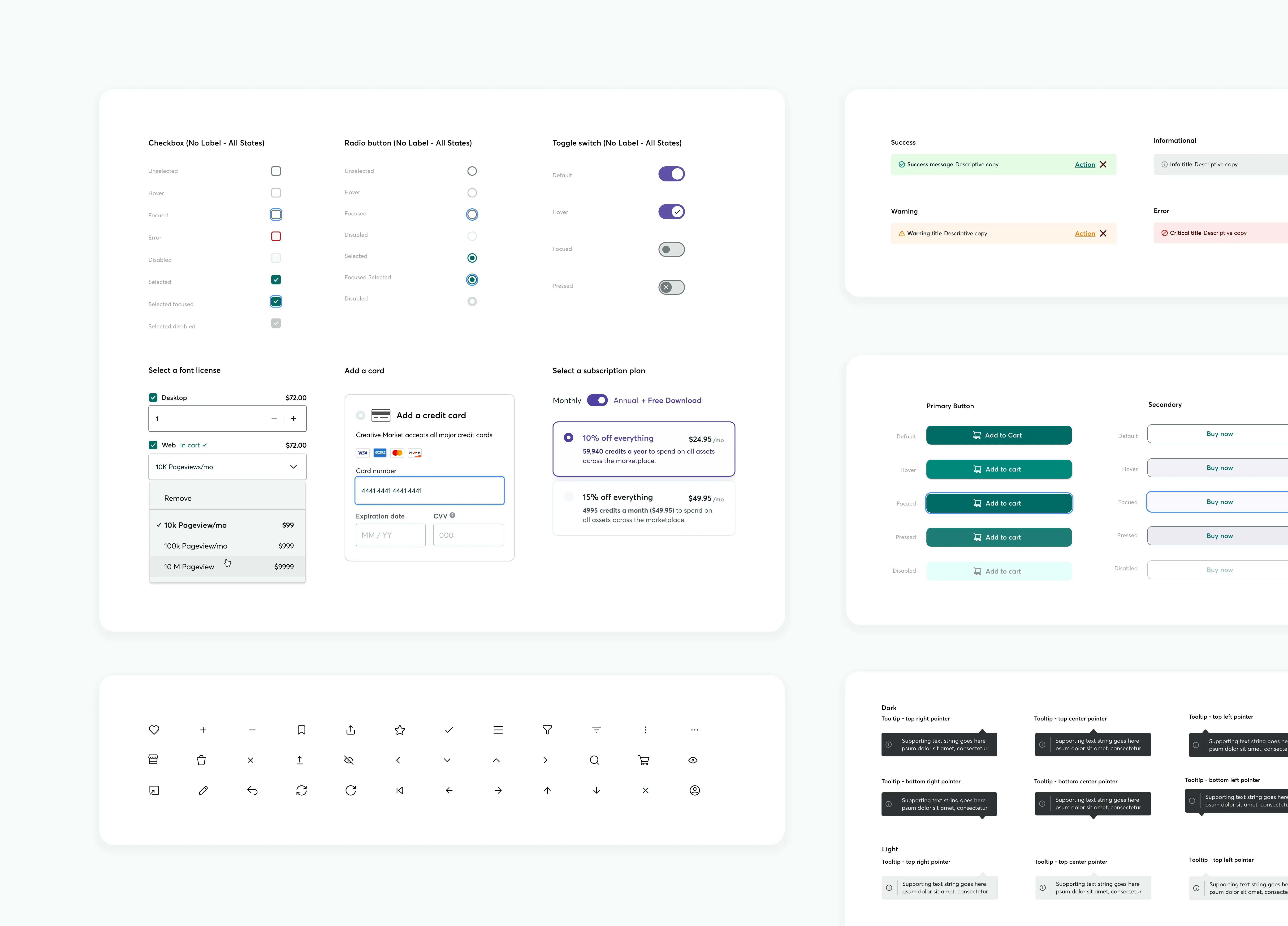
Building an Accessible Design System at Creative Market
Effective communication is essential in Product Design, serving as the guiding principle. When properly managed, a Design System can lay the groundwork for future possibilities. This design system, created in Figma, focused on enhancing accessibility and interaction affordance, aligning with existing brand colors, and utilized Google M3 UI Kit to streamline workflows and improve the user experience across all products.
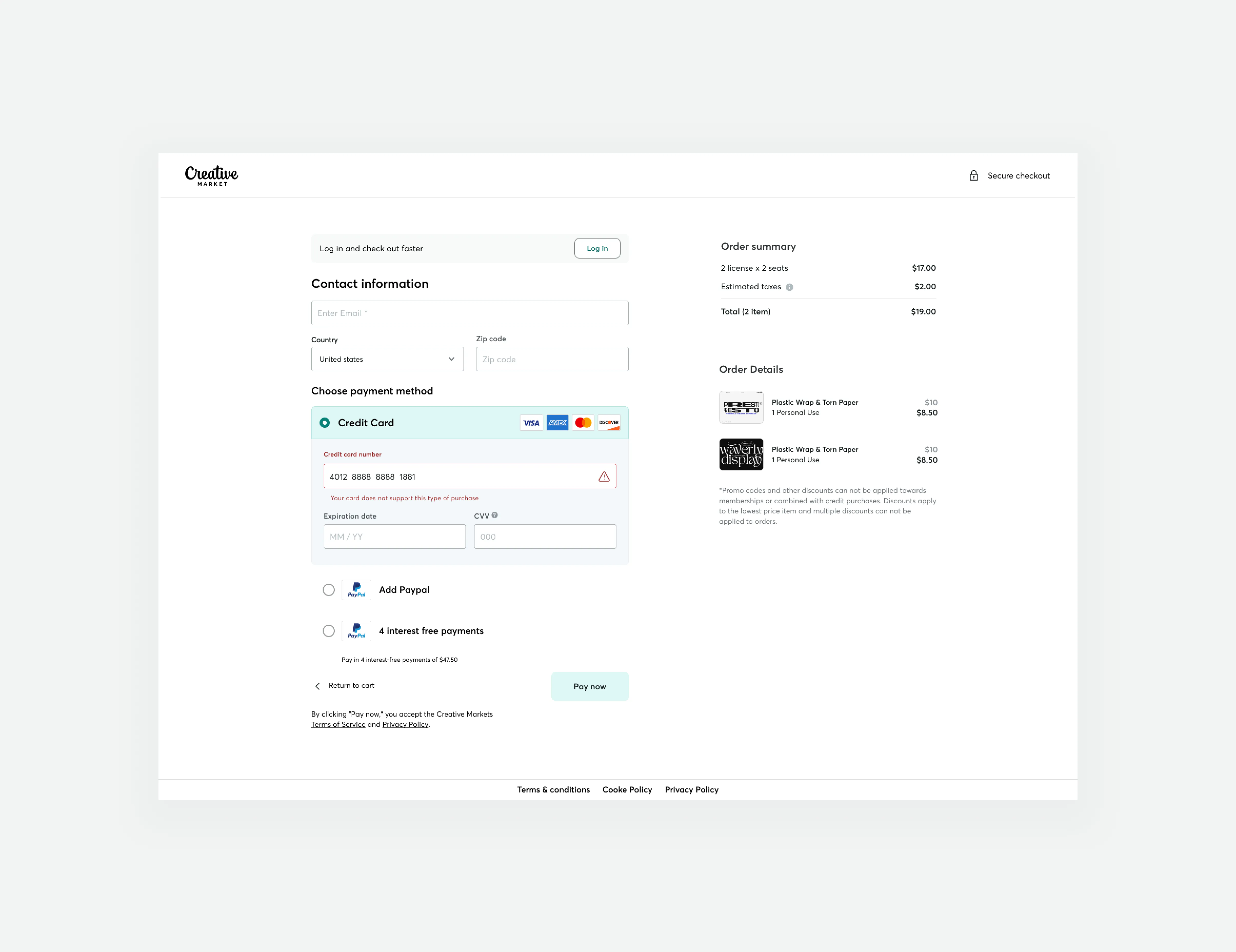
Guest checkout impact at Creative Market
We successfully increased conversion rates and revenue generation by developing a new guest checkout aimed at reducing cart abandonment rates. This accomplishment was made possible by emphasizing primary calls to action, adopting form design best practices, and prioritizing trust and security.
