User account purchase and font download at Fontspring
As part of our comprehensive redesign project at Fontspring, one of our main objectives was to significantly streamline the post-purchase process. We paid specific attention to making the retrieval of fonts and licensing details more intuitive and user-friendly.
Brand
Fontspring
Role
Product Designer
Platforms
Desktop / Mobile
Date
Mar 4, 2022
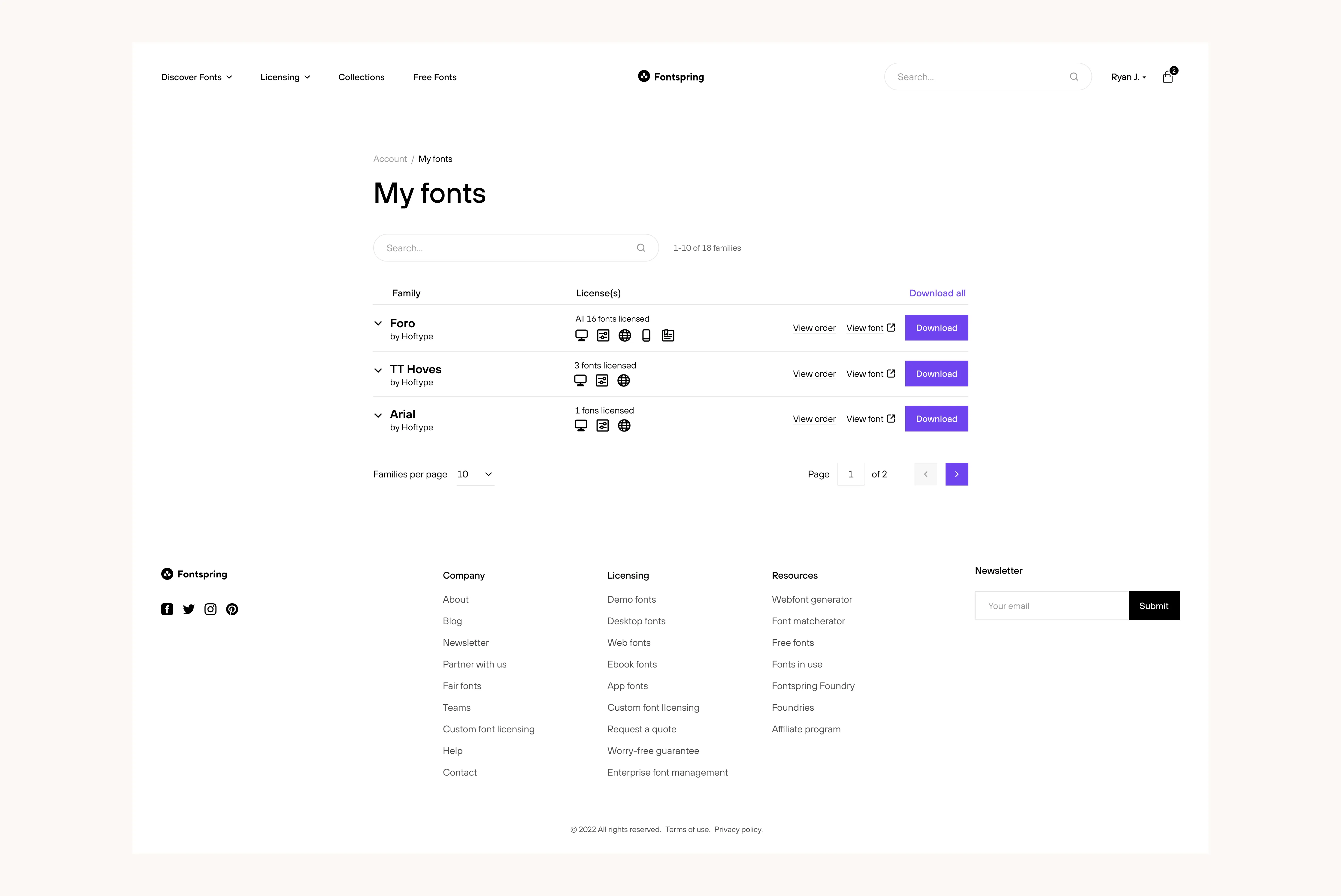
"My Fonts" file download and license details
Background
The process of retrieving fonts and accessing licensing details forms a critical part of the overall user experience. As such, focusing on improving this particular aspect was a high-priority item on our redesign agenda. We had a keen understanding of the need to make this process as seamless as possible to maintain and enhance user satisfaction levels.
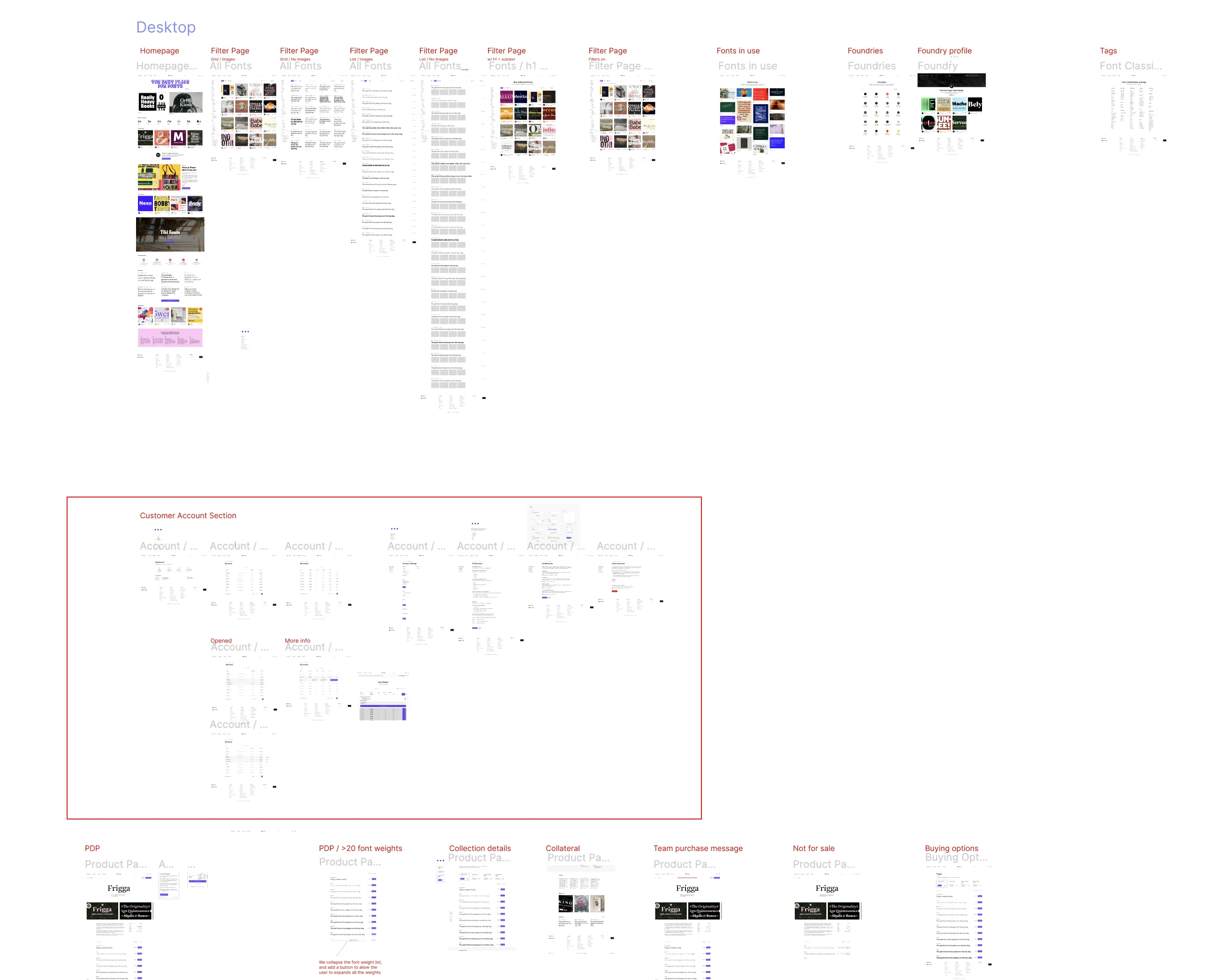
Screenshot of redesigned pages in Figma
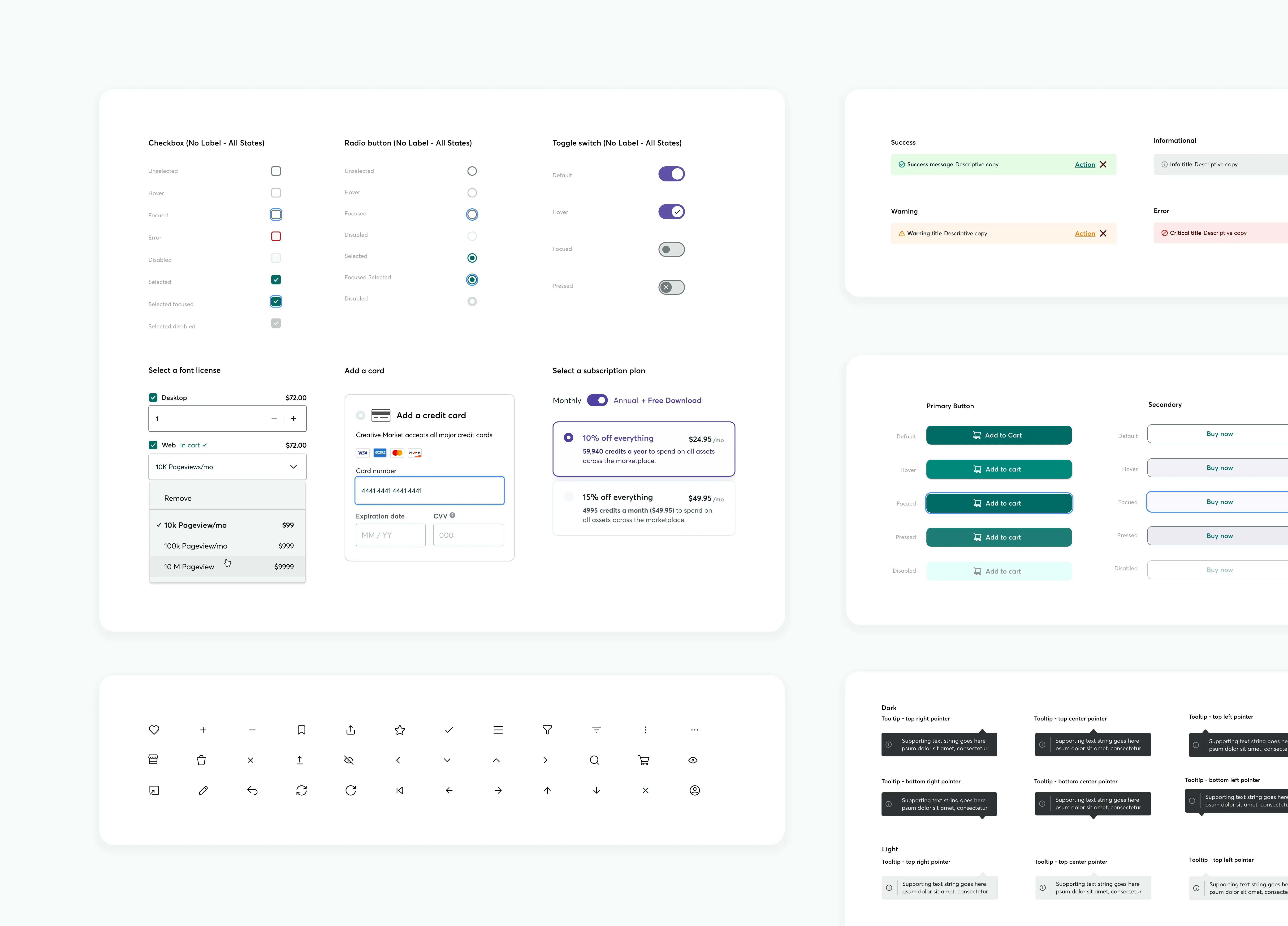
Early version of the the Design System cover for Fontspring
Approach
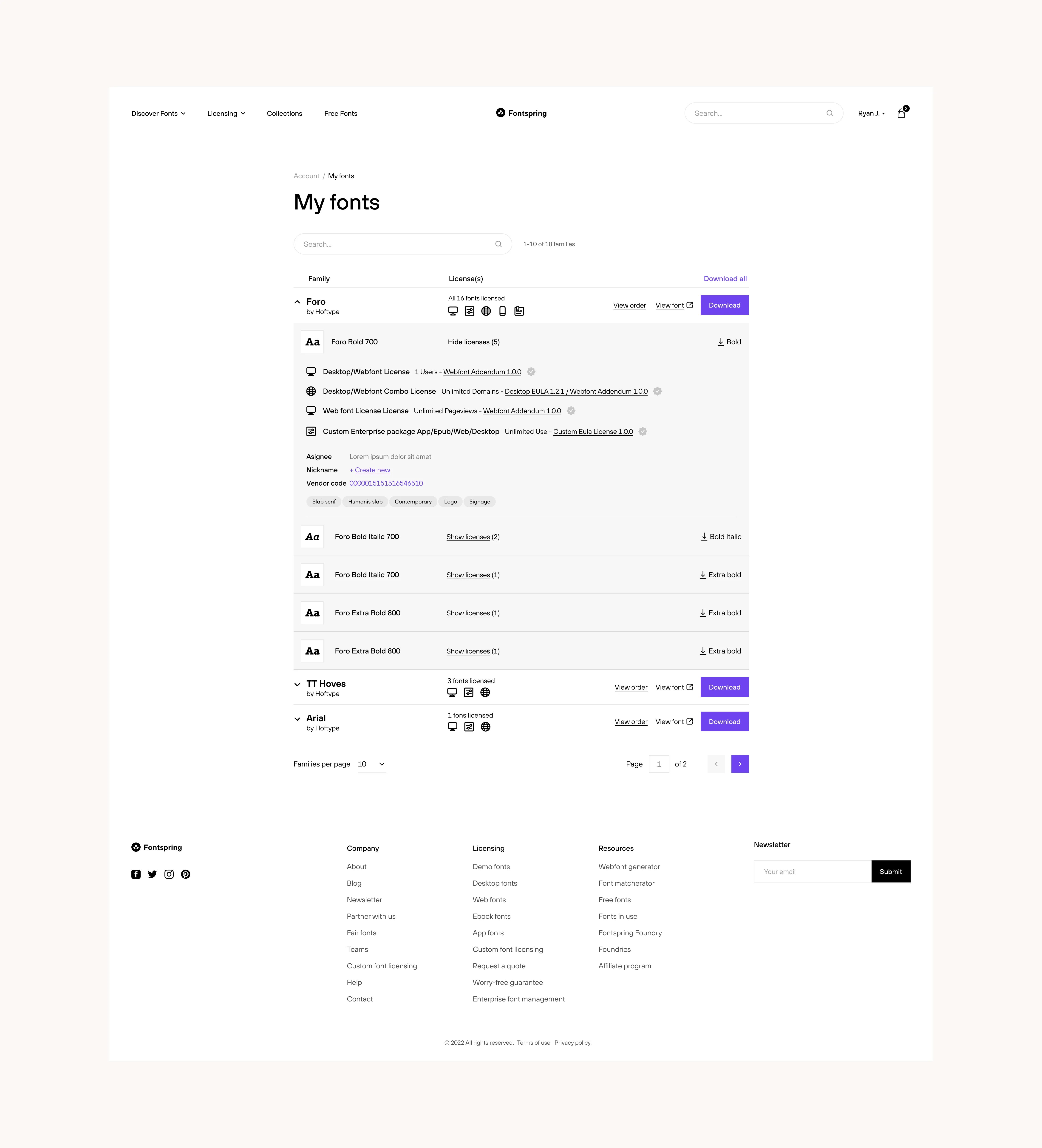
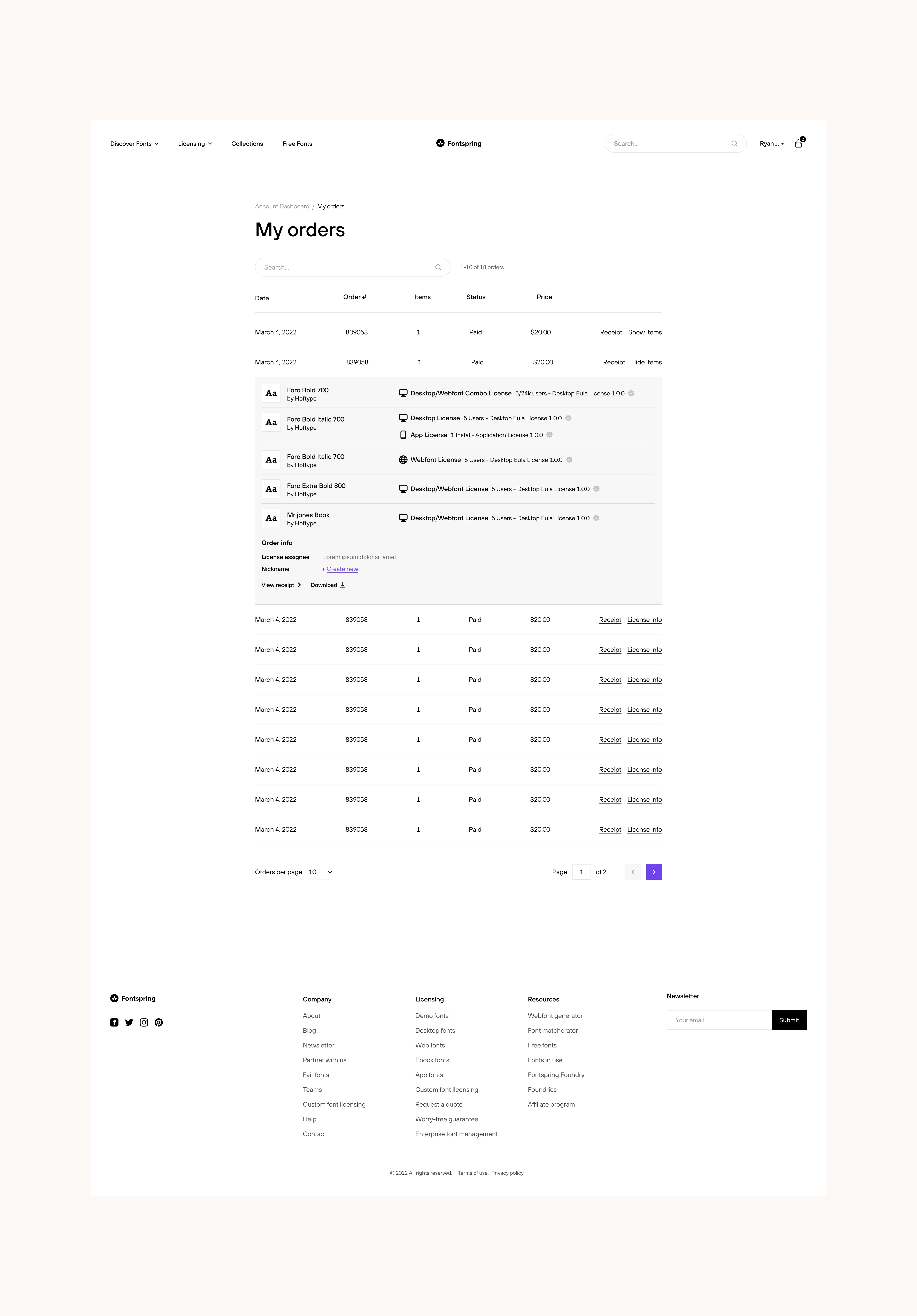
After the Product Manager outlined the problem and briefed the project, I iterated a number of solutions and landed on an expandable table to solve the problem. This table uses the concept of progressive disclosure to prevent users from feeling overwhelmed by the information. We created it using the comprehensive design system specifically created for the redesign. This component is designed to contain a wealth of details and provide links to other relevant user account pages.
Navigating from account home to "My Fonts" and "My Orders"
Fully expanded tabled with weight download and license details
Expanded table with order details and links to download
Impact
The end result of our redesign was a sleek, efficient interface that greatly enhanced the font downloading process. The updated design introduced a more organized labeling system, simpler linking, and a clearer "My Fonts" download and "My Orders" page. With careful attention to detail, we developed a system that not only made navigation easier but also streamlined the font file download process.
This solution not only enables individual weight download but also provides detailed and easily accessible information about the various license types. Furthermore, this design was seamlessly integrated into the "My Orders" section to ensure a cohesive user experience.
More Case Studies
Building an Accessible Design System at Creative Market
Effective communication is essential in Product Design, serving as the guiding principle. When properly managed, a Design System can lay the groundwork for future possibilities. This design system, created in Figma, focused on enhancing accessibility and interaction affordance, aligning with existing brand colors, and utilized Google M3 UI Kit to streamline workflows and improve the user experience across all products.
Guest checkout impact at Creative Market
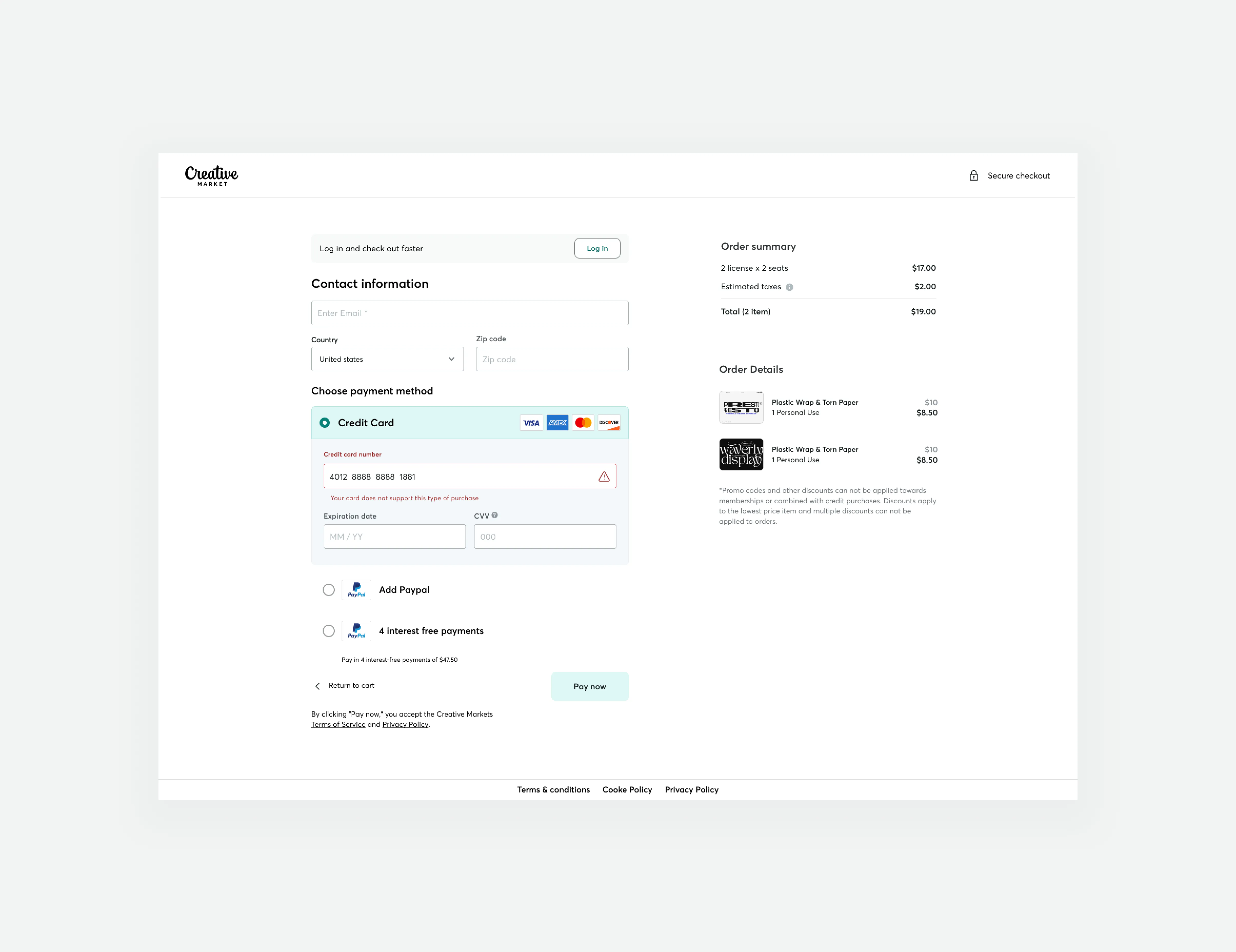
We successfully increased conversion rates and revenue generation by developing a new guest checkout aimed at reducing cart abandonment rates. This accomplishment was made possible by emphasizing primary calls to action, adopting form design best practices, and prioritizing trust and security.
