Buying a home warrany from American Home Shield
As part of our efforts to improve our services and customer experience, we set out to improve upon the way our customers purchase home warranties from American Home Shield. This included addressing issues with the ordering process, understanding our competitors' practices, and refining our coverage descriptions.
Brand
AHS.com
Role
Sr. UX Designer
Platforms
Desktop / Mobile
Date
Sep 15, 2020
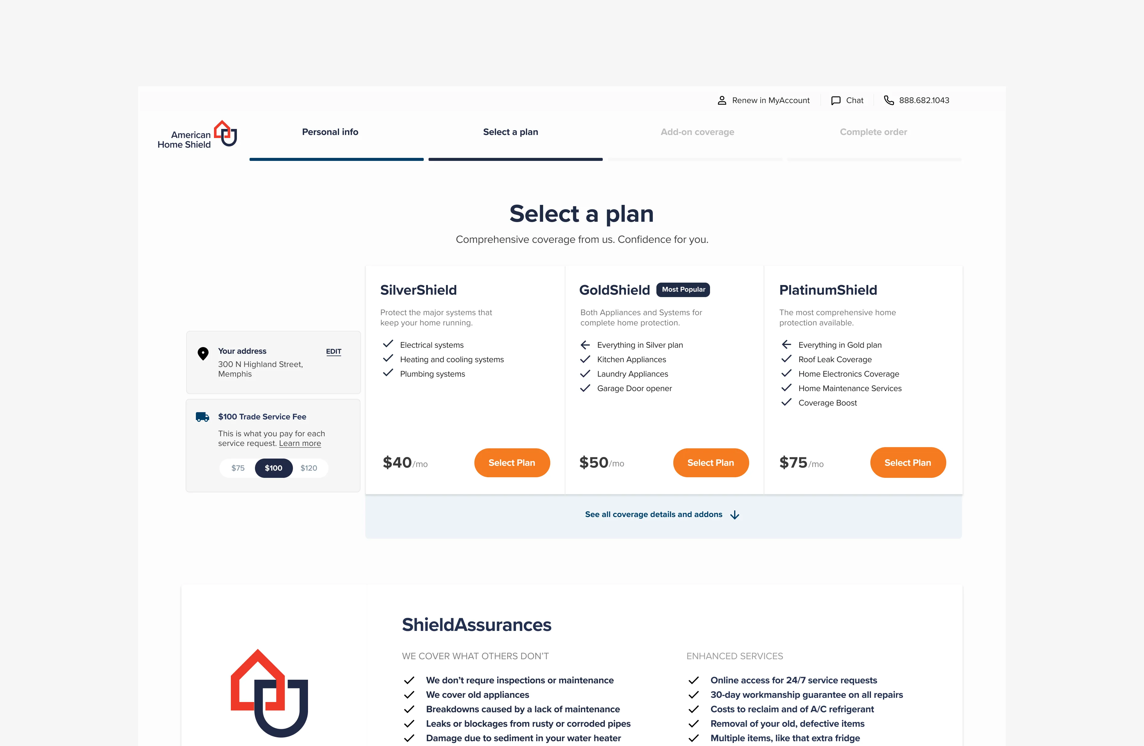
American Home Shield Select Plan page
Background
Through initial baseline testing and intercept surveys, we discovered several issues with our current shopping process. These included a non-intuitive sequence for entering billing and credit card information, frequent skipping of form fields by users, and vague error messages. We also noted that our customers had reservations about providing information to get a quote.
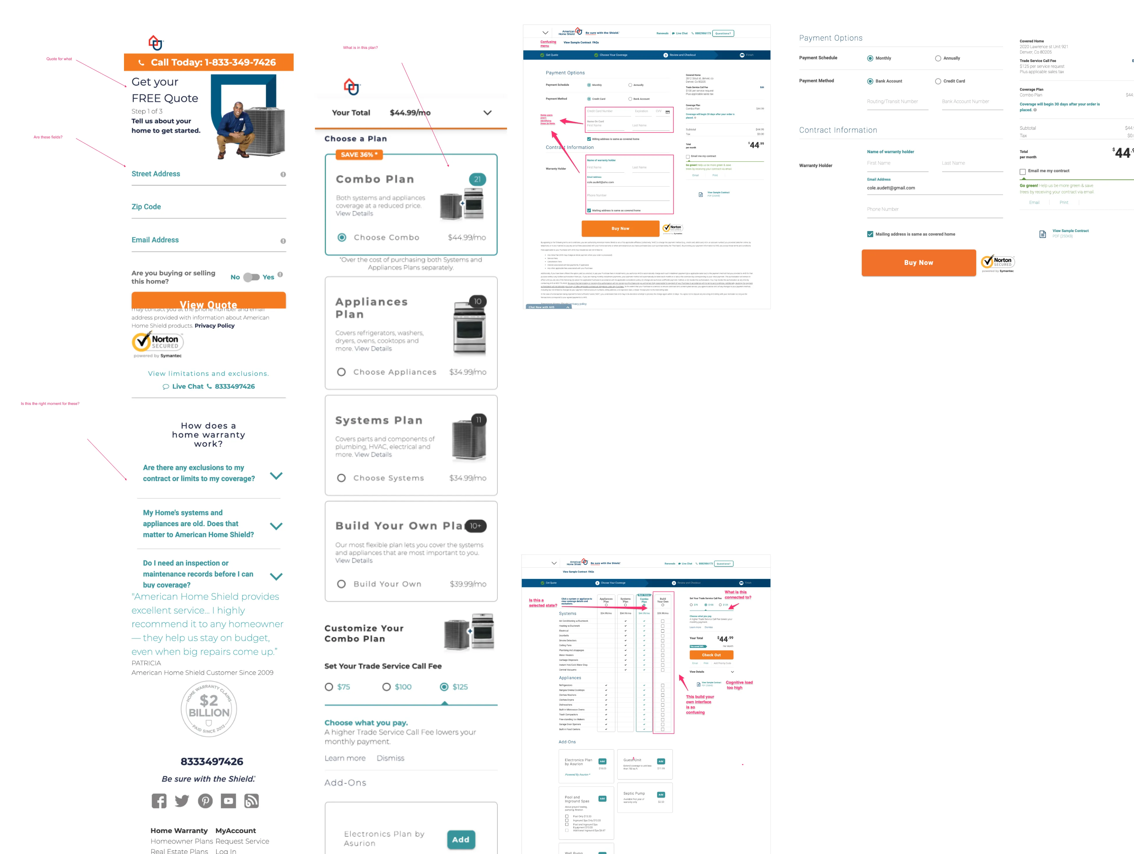
Documenting problem areas in the warranty buying flow
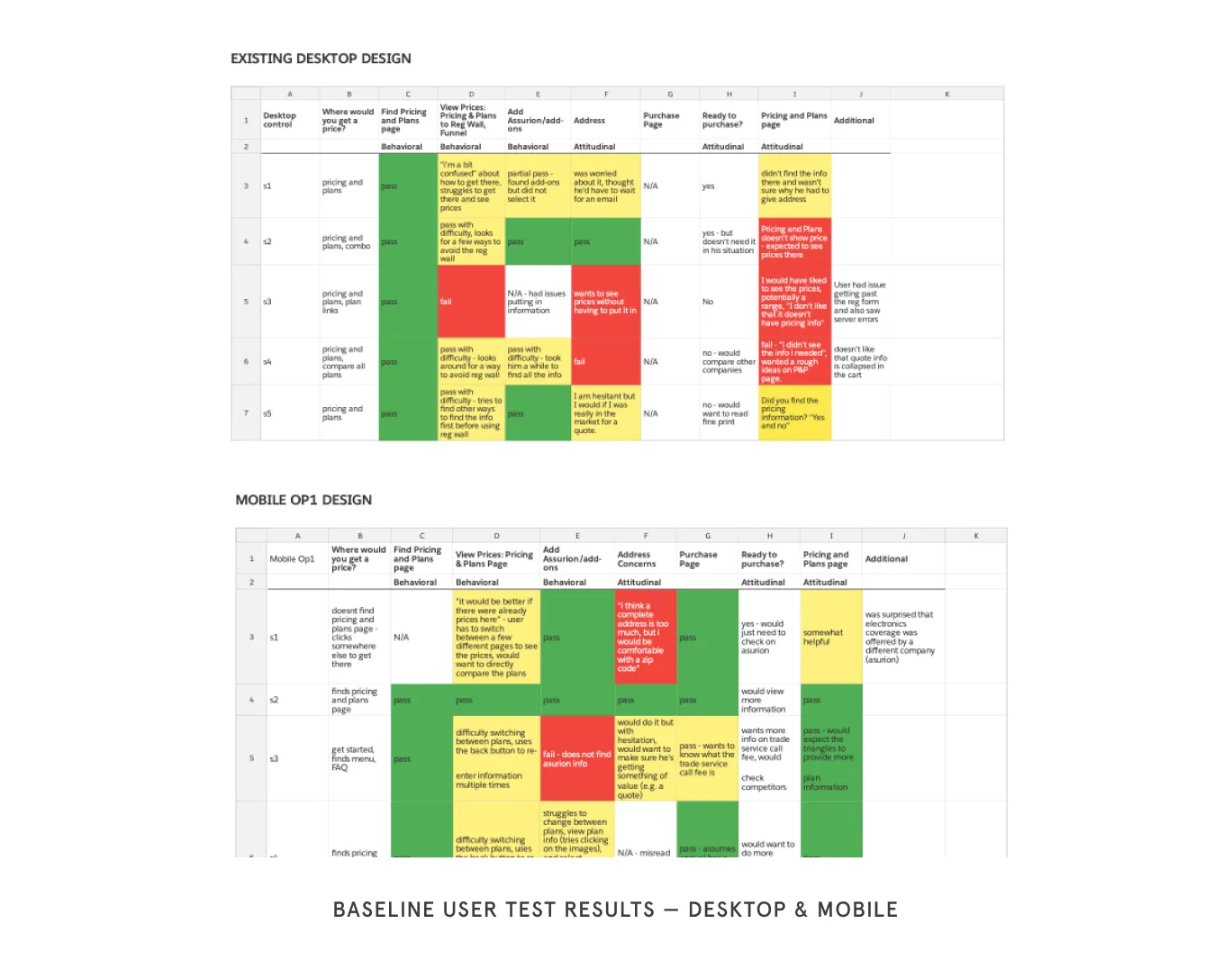
Usability test results
Approach
Our approach to address these issues involved several strategies. Firstly, we conducted a competitive analysis to understand the online experience that our competitors were providing. This helped us to align our approach with industry standards and user expectations.
Next, we focused on improving the comprehension of our coverage and its information architecture. We used a card sort of our existing coverage and asked users to generate their own categories, leading to a restructured and more user-friendly coverage description.
In our design phase, we conducted research to stand out from our competitors by providing key information, such as service fees, earlier in the checkout process. We also emphasized features of our product that customers valued and which our competitors lacked.
Video of home warranty purchase process
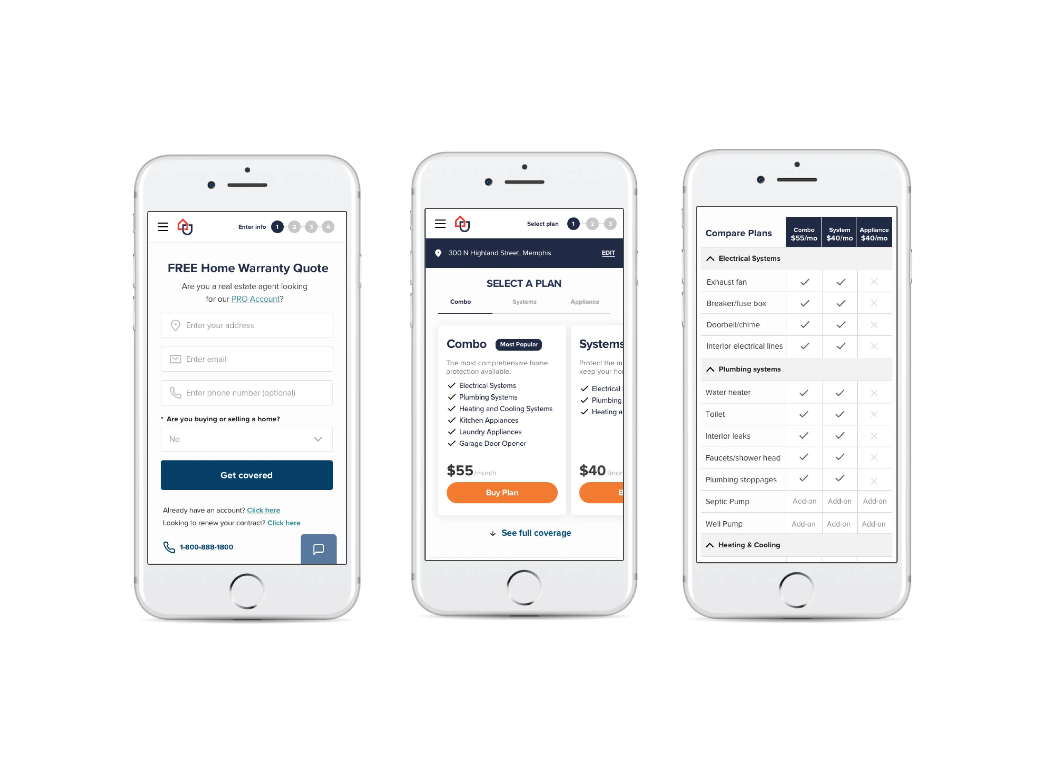
Sign up and mobile select plan design patterns
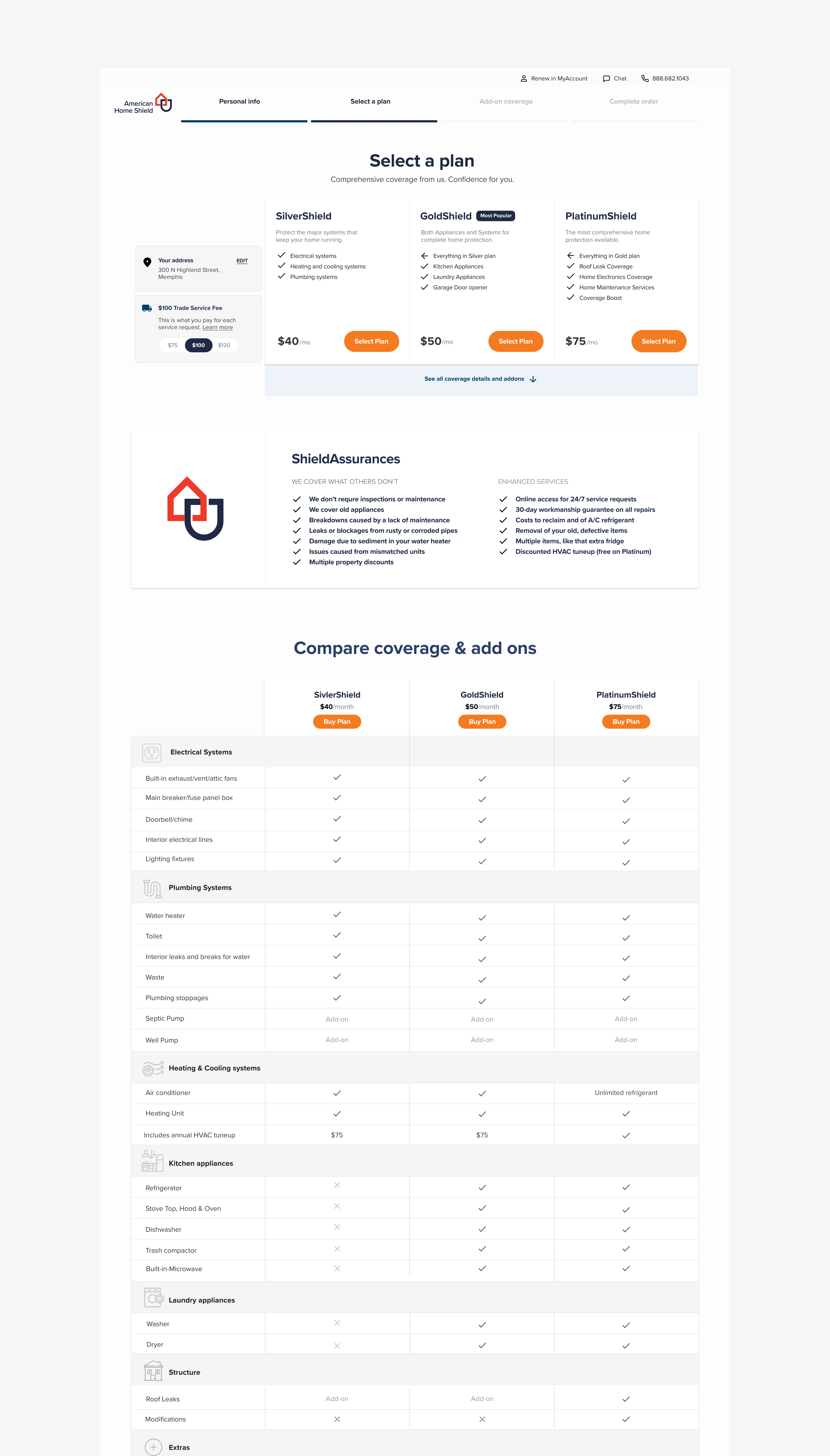
American Home Shield Select Plan Page
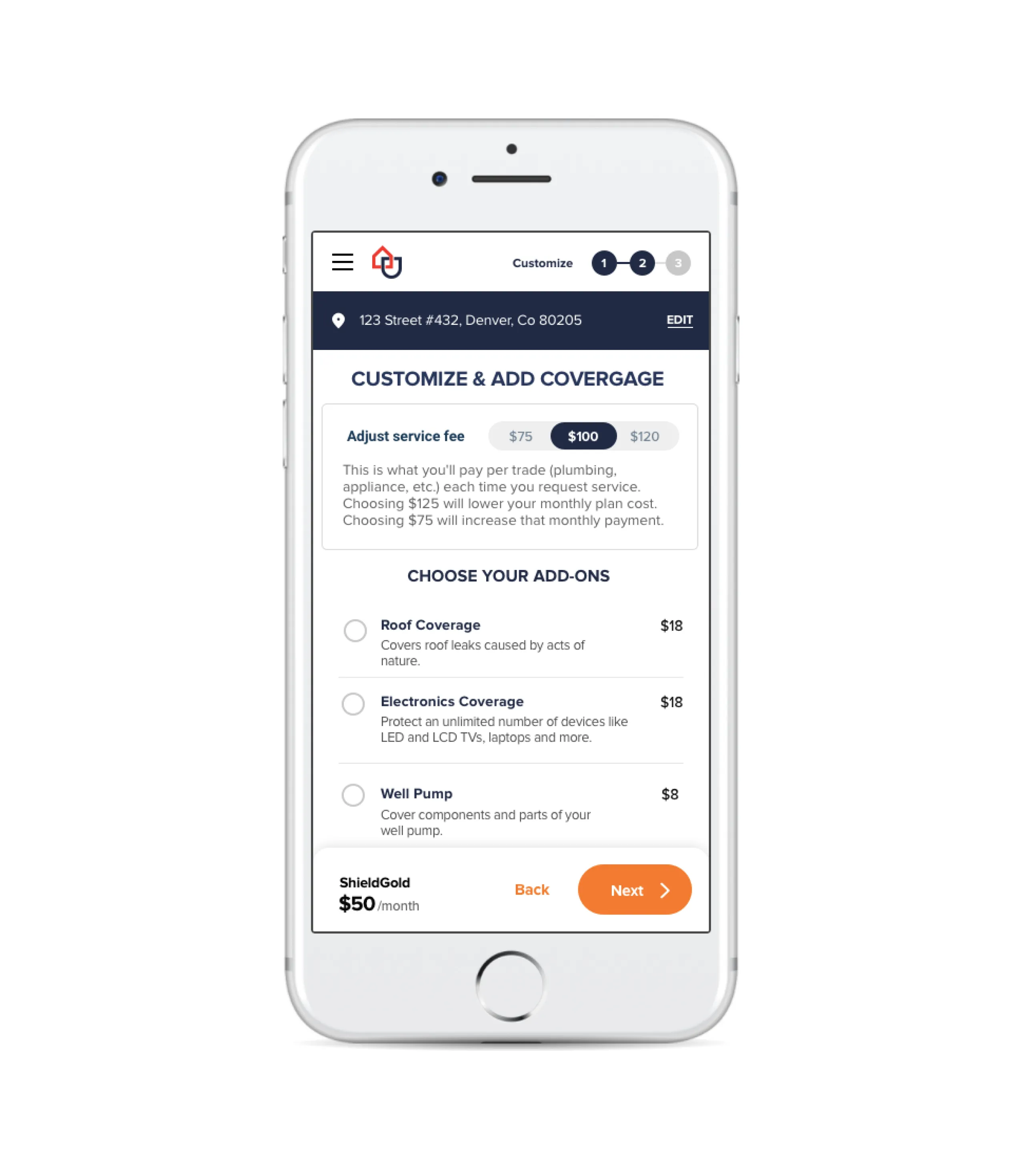
Mobile Add-on page
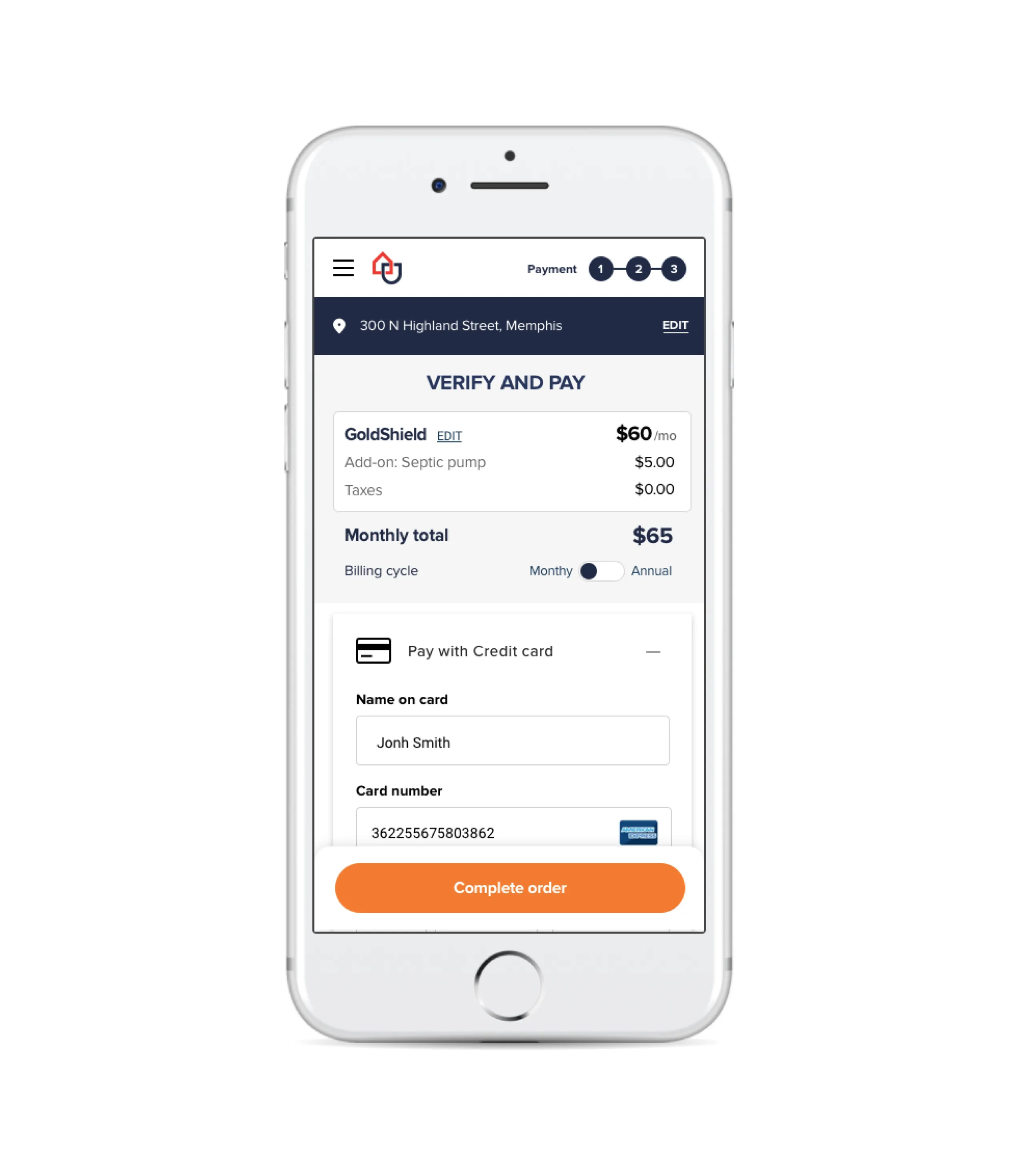
Mobile payment page
Impact
The new design significantly enhanced every aspect of the checkout process, especially for mobile users. Despite some ideas not being incorporated at launch due to time constraints, the redesign resulted in a 23.18% overall increase in conversions (from 5.63% to 6.93%) and a 62% rise on the plan selection page (from 12.25% to 19.91%). These improvements were notable, even though there were more pages in the flow but fewer interactions. Additional A/B testing on the funnel led to further enhancements in signup and options to bypass certain parts of the flow.
More Case Studies
Building an Accessible Design System at Creative Market
Effective communication is essential in Product Design, serving as the guiding principle. When properly managed, a Design System can lay the groundwork for future possibilities. This design system, created in Figma, focused on enhancing accessibility and interaction affordance, aligning with existing brand colors, and utilized Google M3 UI Kit to streamline workflows and improve the user experience across all products.
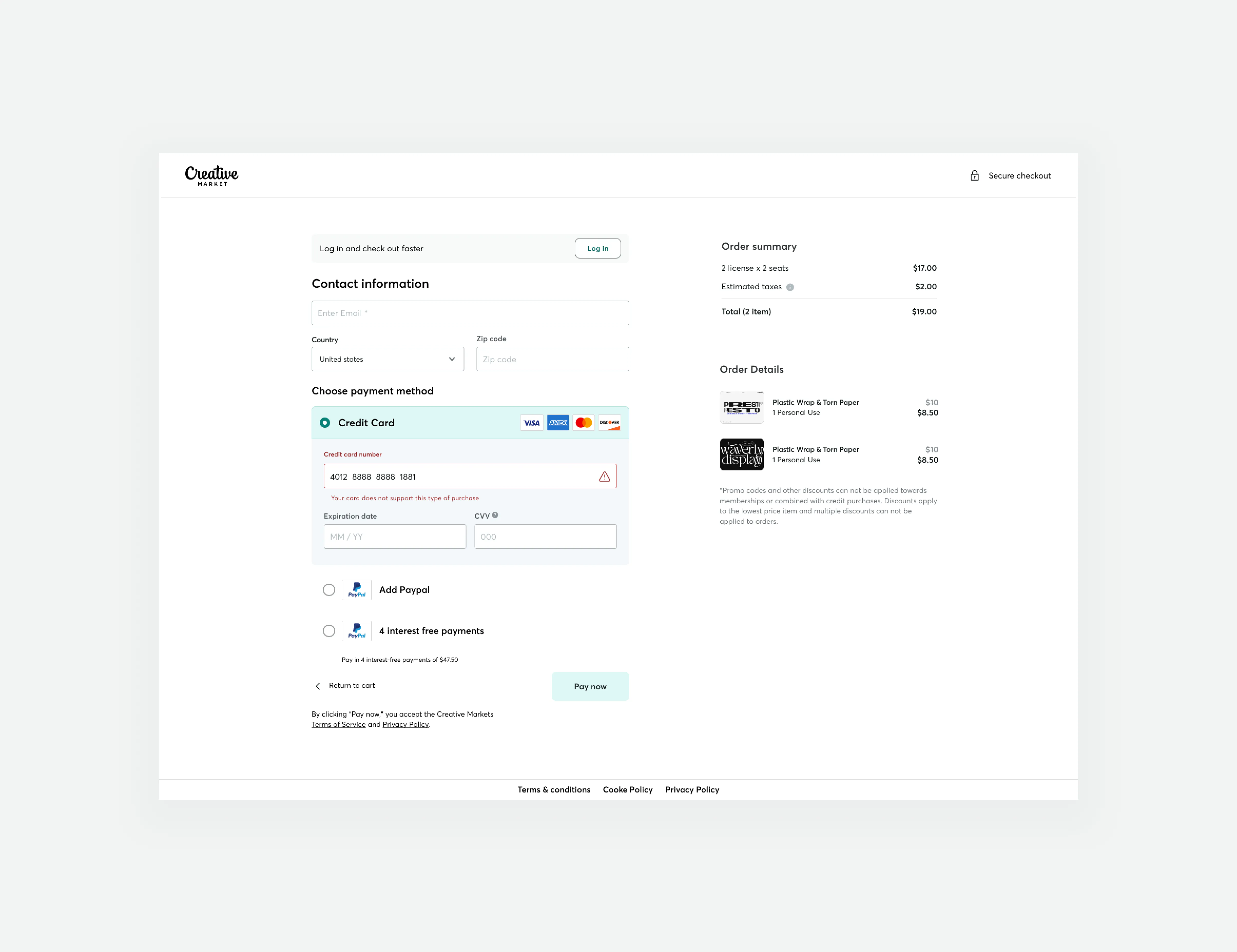
Guest checkout impact at Creative Market
We successfully increased conversion rates and revenue generation by developing a new guest checkout aimed at reducing cart abandonment rates. This accomplishment was made possible by emphasizing primary calls to action, adopting form design best practices, and prioritizing trust and security.